CitizenMe: Website Landing Page Redesign
Overview:
CitizenMe is a London based market research company. After joining the company as a full-time Product Designer, the first task I was assigned to redesign the home page of the company website. With the previous design, the company was experiencing some unexpected problems, like wrong signups, many customer support calls because the users were to understanding how to use the product. I was assigned to investigate the problems users are experiencing, why they are experiencing their problems and how to solve the problems in order to provide the right product to the right user.
My Roles:
Primary Researcher
Wireframe Designer
User Interface Designer
Collaborator with Developer
Duration:
4 Weeks
(including the development time)
Deliverables:
I was assigned to do the user research, design new page that brings better experience to the users.
Understand & Define Problem:
Understanding Users:
The company has two different types of users. One is Citizens who come to the website and download the mobile app. In the app they take surveys, and in return they receive cash rewards, insight about themselves and funny comparison between themselves and the other users. Second type of users are the clients who use the company’s web platform to ask any question to the Citizens (mobile app user). This way they collect organic user data through the company’s platform.
Interviews:
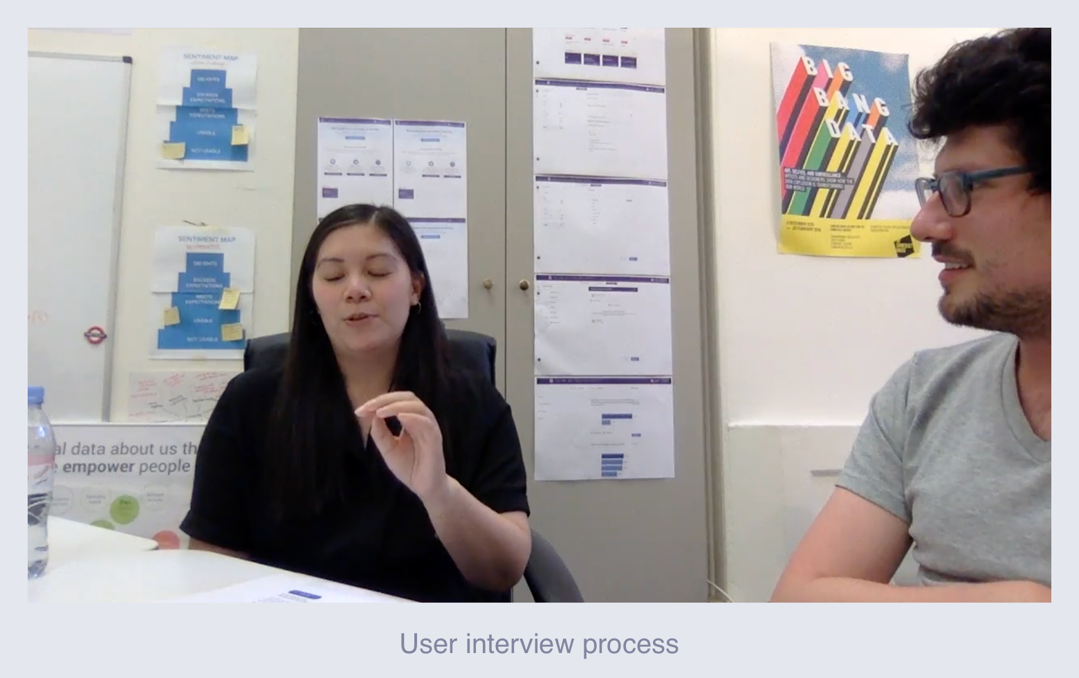
We have taken 10 user interviews about our website. We asked various detailed questions of about the website. Questions included: what they think of the website, what they think the value proposition of the company, do they understand what the company does, did they find what they were looking for, how they would completing particular task, do they know what the company offers and so on.
Analytical Research:
Every week, approximately 60-70 people intending to download the app, but accidentally register on ce.citizenme.com instead of downloading the app.
Around 70% visitors of the websites are citizens and 30% of them are clients.
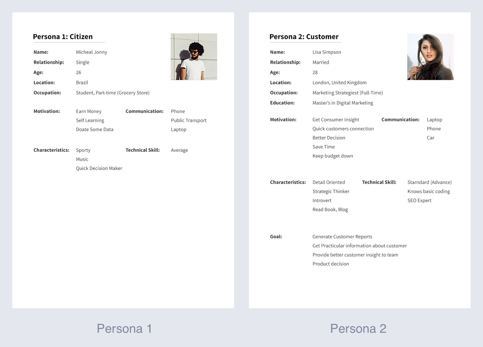
User Research: Persona
After analyzing all research data we moved to design personas. Based on users type we have designed 2 different types of persona. One was reflecting citizens and the other one is for clients.
Most common problems:
According to the research we have done for the website, we found there are 3 major problems.
1) Wrong signups by Citizens:
The citizens coming to the website to download the app and take survey. But instead of downloading the mobile app they were signing up as client.
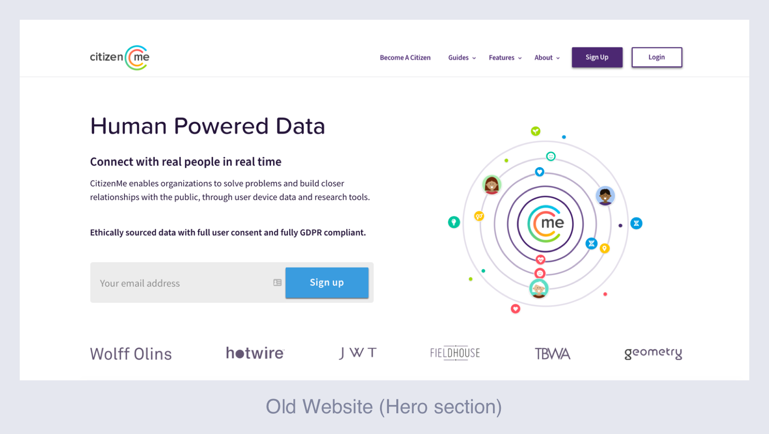
2) Confusing Layout and information:
The information and imageries available in the website are very confusing. They never explain what the company actually does, what are the benefits of the company is providing and how the entire system works.
3) Clients are not registering:
Clients come to the website but the information available in the website don’t explain it is all about. Therefore, they leave the website without registering.
Competitor Research:
We looked on our direct competitors and tried to understand how they are solving these problems. Toluna, Attest, Streetbees, SurveyMonkey were our direct competitors. One common thing we found with all of our competitors is that they have one particular type of user focused website, whereas we are trying to provide solutions to our both types of users from the website. We looked on other websites such as Amazon, eBay etc who have two types of users and we found everyone is targeting the users who are doing business (spending money) with the company.
User Priority:
After all the competitor research we have decided to target both types of user in our website. Because, our 70% visitors are citizens and 30% visitors are clients, and both come here for purpose, either downloading the app or doing business with us. According to the personas, our client come to the website for professional purpose such as, learn about our product and doing business with us, whereas the citizens come to the website to download the app. Based on those thoughts we have decided to design the website in a way that it gives high priority to our clients and low priority to the citizens.
Product Solutions:
Solution 1: Control the wrong signup
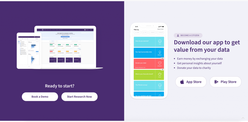
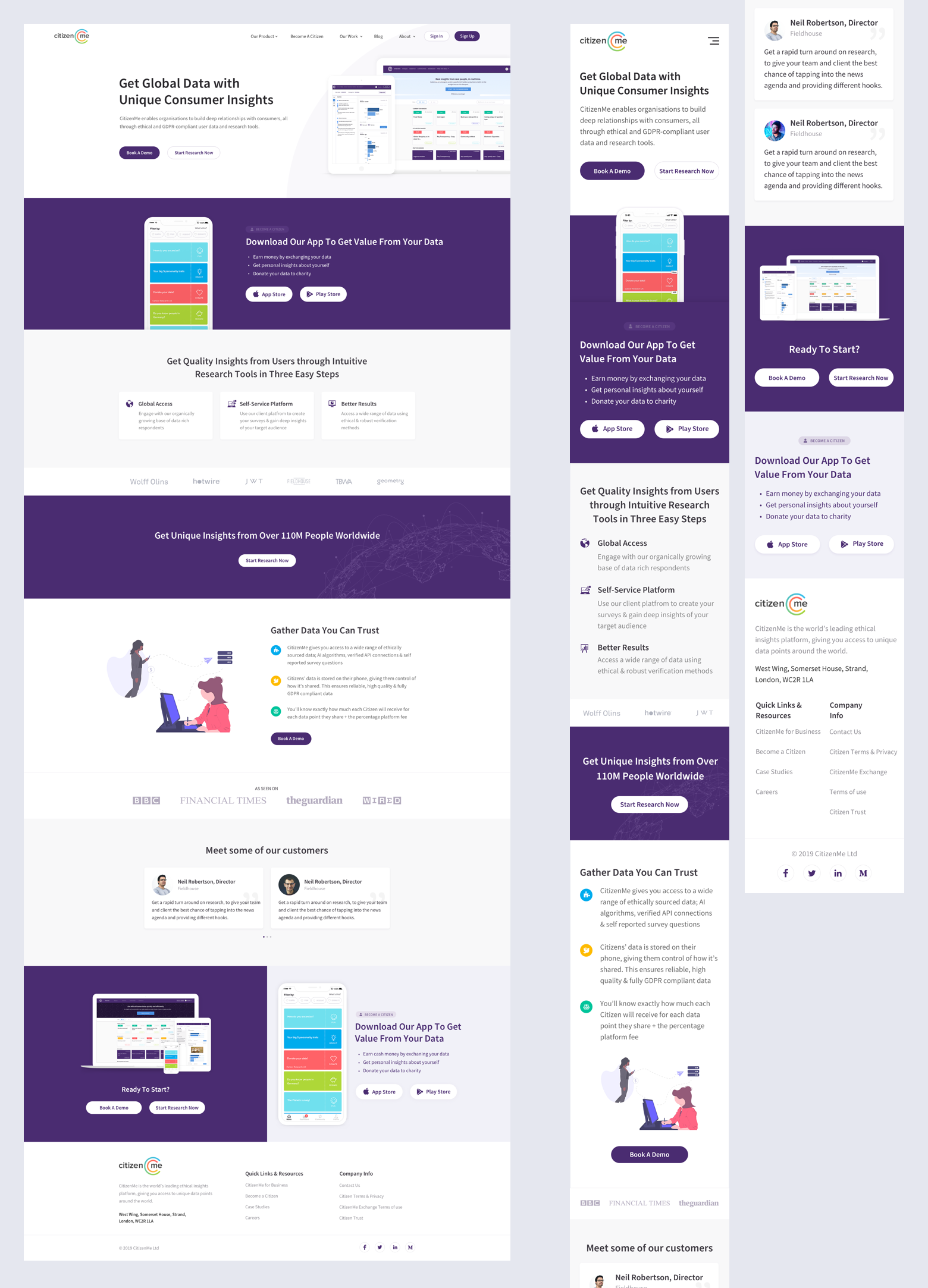
According to the citizen’s persona, our citizens are less professional, majority of them are young user, and they come to the website to download the mobile app in order to get value from it (maybe cash rewards or insight about themselves etc.). And when they launch to the website, they see a signup form in the hero section of the website. Since, they have less patience to read and they are more excited to downloading the app that’s why they fill the signup form intending that it’s the way to downloading the app. Also, the App Download section was very small comparing with the number of citizens coming to the website. Keeping these contexts in mind we have agreed to remove the signup form the hero area. So, the citizens would have less chances to signup. Also, the team agreed with me to enlarge the “Download App” area in order to make it more obvious for the citizens to see it.
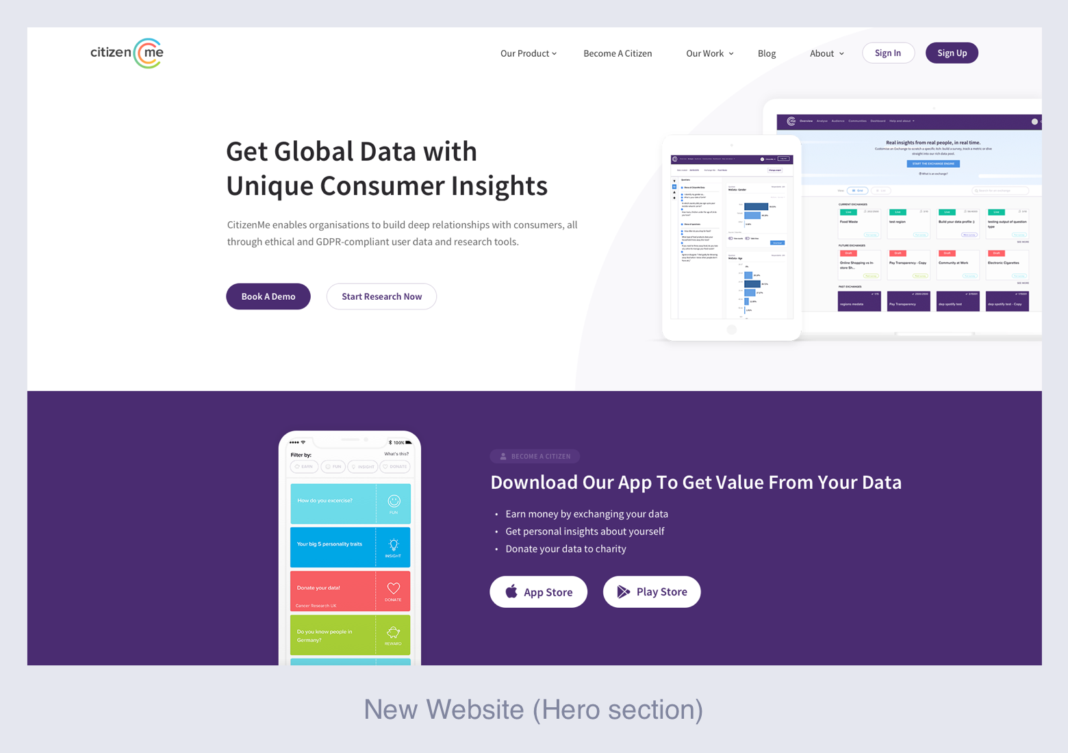
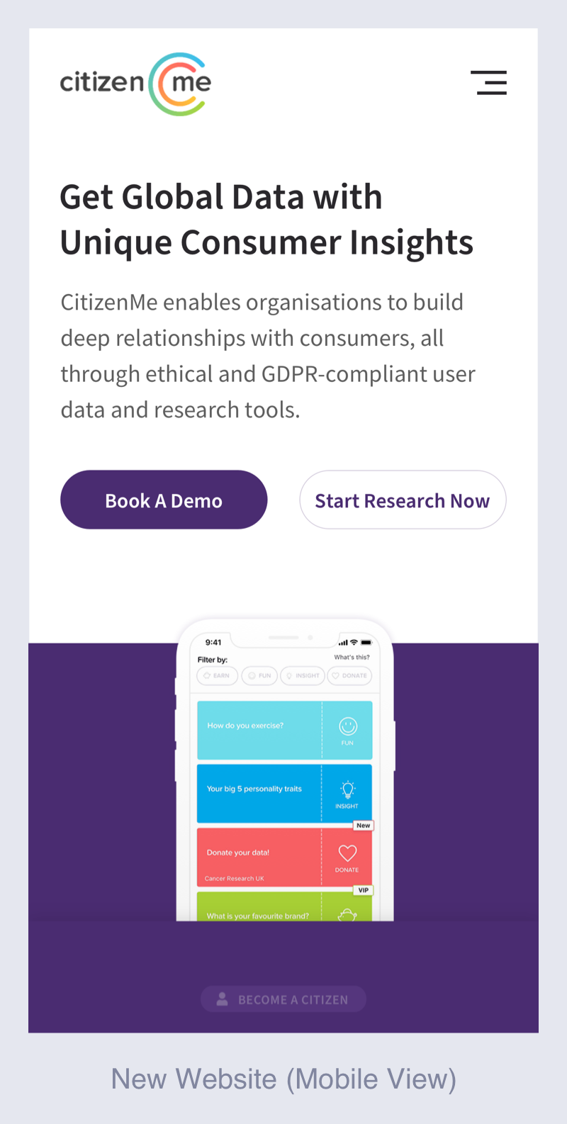
The user research says, more than 90% of the citizens coming to the websites are mobile users, and only few portion of the clients are visiting website by using mobile. This data made us to remove our client-platform’s screenshot from the hero section for the mobile view version of the website. By doing this the hero section had enough space to introduce mobile app download section. As a result, the excited citizens come to the website from mobile device and can see the app download section without scrolling down.
Solution 2: Confusing Layout and information
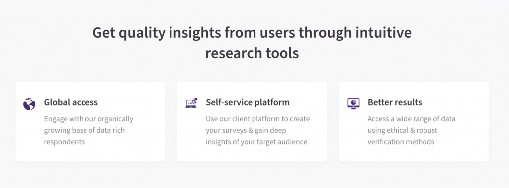
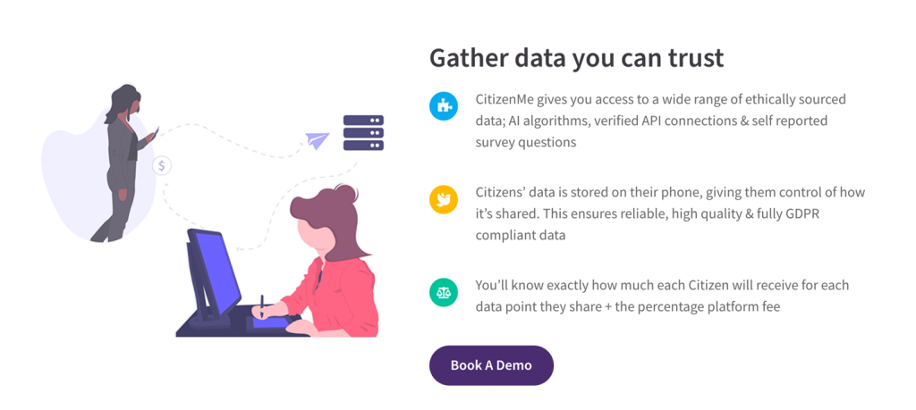
Unlike the previous version with various confusing animations and images and multiple hierarchy of text/copy in each section, we introduce new imageries of our actual products, showing the clients benefit of our products and how it works by providing storytelling graphics and text/copy.
Solution 3: Clients are not registering
Since the new copy and imageries of the website telling the story of the company in more details, it increase the user credibility. We provide another CTA button at the bottom of the page with our platoform’s screenshot, so that after scrolling down the website instead of leaving, clients can see the CTA button which can trigger them to register. And instead of saying Signup or Register, say called it “Start Research Now” which is a more actionable CTA name. Also, we assume that many citizens can come at the bottom of the website to understand about the company. Therefore, we need another CTA area to download the app. For that reason, we provided the App store and play store download button on the bottom.
Extra Feature:
Book A Demo
Research indicates that there is a tendency for the users to see the result before they buy it. By keeping this idea in mind, we also introduced “Book A Demo” CTA button for the user. With this feature, our clients can get a real human connection before spending any money and they can see the how it really works without registering or buy any service from us. Our team really liked this idea and decided to make it as the primary CTA button, because it will take less effort for the clients to book a demo, and user will trust our company/service more.
Design & Prototype:
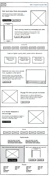
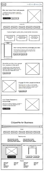
Wireframe Design:
Based on the research data, I have designed few versions of the wireframe. I shared the wireframe with our product team to get some initial feedbacks. My team members were really happy to see the first version of the wireframes, but they made some criticisms where I really agreed with them and iterated the wireframe. Below are few of the wireframes I created:
UI Design:
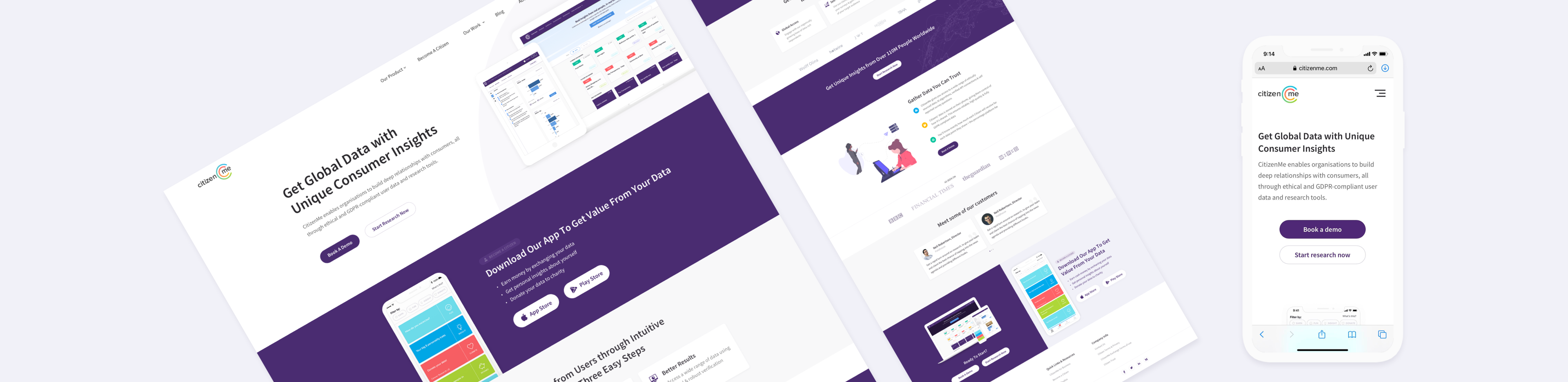
After completing the wireframe I have started to design the UI of the website. I started with reading the style guide of the company. As I was new in the company, it was important to learn about the design style of the brand. After reading the style guide I have started to design the high-fidelity interface. I have created 5 initial drafts to show some team members. They really liked how I removed the “Signup” form from the hero section which was driving so many wrong signups. Also, they liked how replaced the previous animation with the screenshot of client platform, which makes more sense as the CTA buttons are for clients, not for citizens. However, they did some criticism of the design, and the copy too which I really appreciated. Below are few examples of the initial drafts:
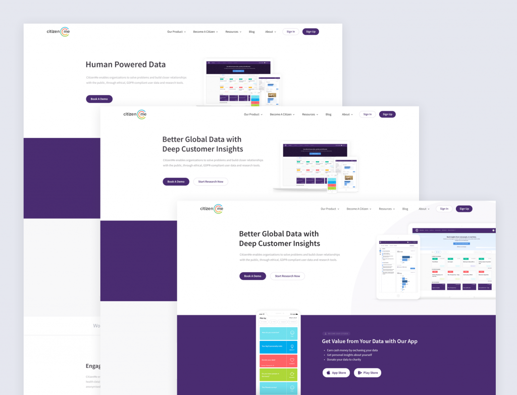
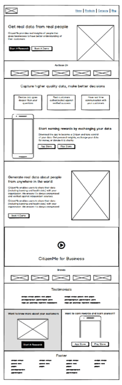
After taking the team feedback I have iterated the design several times and ended up having below styles. I show both to the team and the team finally selected one which was saying the how the company works in better way.
User testing and iteration:
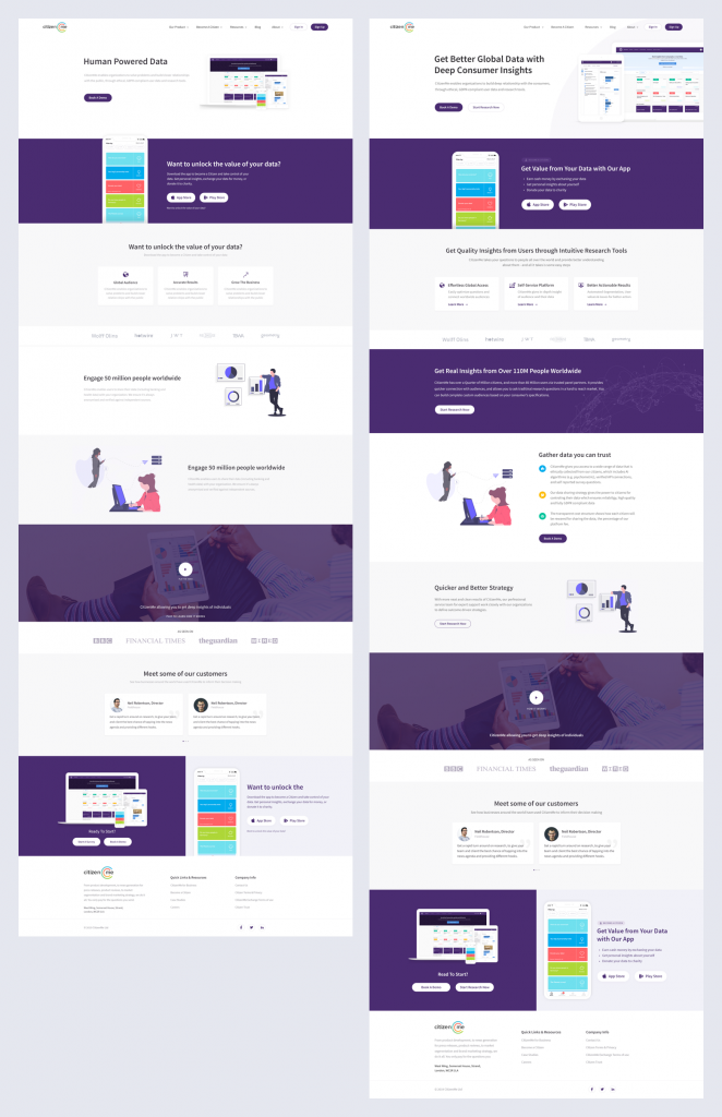
During the user testing we found some interesting facts, where most the users were claiming they feel that the website is too text heavy and it’s repeating some information which was interesting findings. After that I iterated the design and finally reached to below style for desktop and mobile version:
Results:
The design was able to reach its success metrics.
- Instead of 60-70 weekly wrong signup, we found only 3 citizens made wrong signup in 2 months.
- We found the bounce rate is was increasing which seems a bad indication, but actually the bounce was for the citizens. They started to follow the link to app stores.
- We have seen the clients are booking for demo and they understand what we do better than past.
What’s next?
In product design, problems and challenges appear continuality, and it needs to improve every time. We are analyzing where our users are getting confused, collecting client’s issues from the marketing team. In near future we will release new version solving the new problems.