
CitizenMe: Swiping image question for survey
Overview:
CitizenMe is a mobile app for survey. In a research, our users (Citizens) claimed our current survey format is boring and not engaging. On the other side, our clients were requesting to provide a different kind of survey option instead of typical survey format. They wanted the citizens emotional involvements in the answers, users should understand what they are answering. So, it will bring quality answers from the citizens.
My Roles:
Primary Researcher
Secondary Research
Wireframe Designer
User Interface Designer
Interaction designer
Collaborator with Developer
Duration:
6 Weeks
(including the development time)
Deliverables:
I was assigned to do the user research, competitor research, design wireframes, user interface and interaction designs.
Understand & Define Problem:
Understanding Users:
We conducted a survey to our users (citizens) about our current survey format. Citizens said our question format is typical and boring, sometimes it requires more cognitive effort and focus. They (citizens) suggested the survey questions can appear in fun and interactive way. Instead of reading and thinking about the questions they can be emotional and entertaining.
We found two major problems by the user research
1) Requires reading:
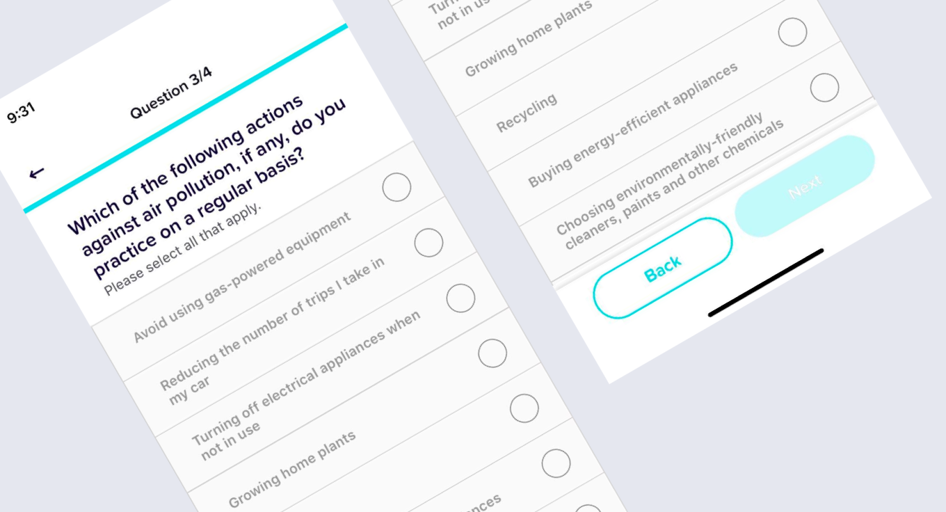
The question format has lot of texts and users need to read all questions and options very carefully in order to provide honest answers.
2) The question type is boring:
Users claimed this kind of questions are very typical and they are not entertaining. This kind of questions are not fun to do and sometimes users lose motivation to complete the survey.
Product Solutions:
We had team session about how to reduce the cognitive effort of user, how can we make the users to read less and how to make it more entertaining. After long discussion, we agreed to introduce the “image swiping” question format.
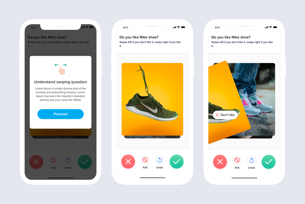
Solution 1 - Use images to reduce reading:
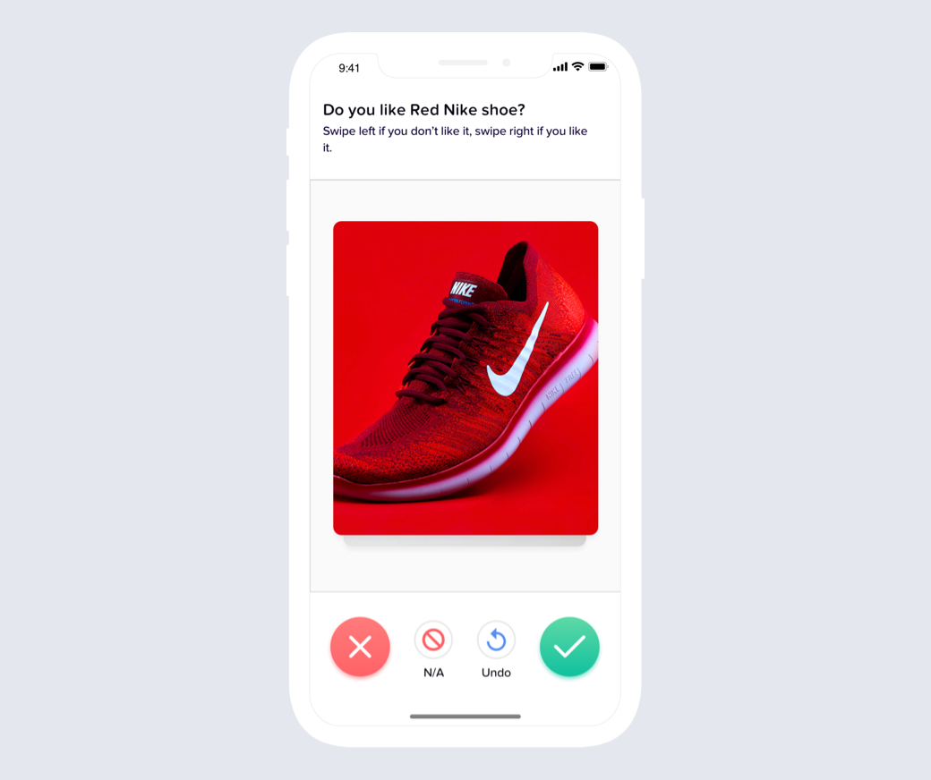
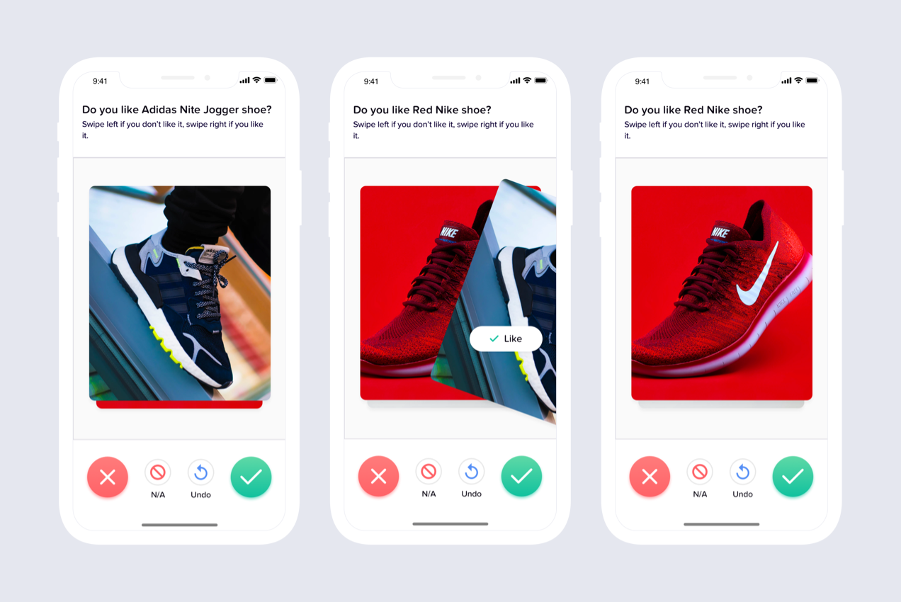
In the image swiping format users don’t read to the list of answer options. They can see the image and swipe/tap right or left if they like or don’t like the image. This format reduces the reading effort significantly.
Solution 2 – Swipe image to answer:
Unlike the typical survey of select and tap for next, user can swipe the image left or right to provide positive or negative answers. It makes the answering process fun and entertaining.
Extra Feature – Undo answer:
We also thought what if someone swipes the wrong way. In order to go back and change they answer we introduced the “Undo” feature. So, user can go back and change their answers.
Design & Prototype
Wireframe Design:
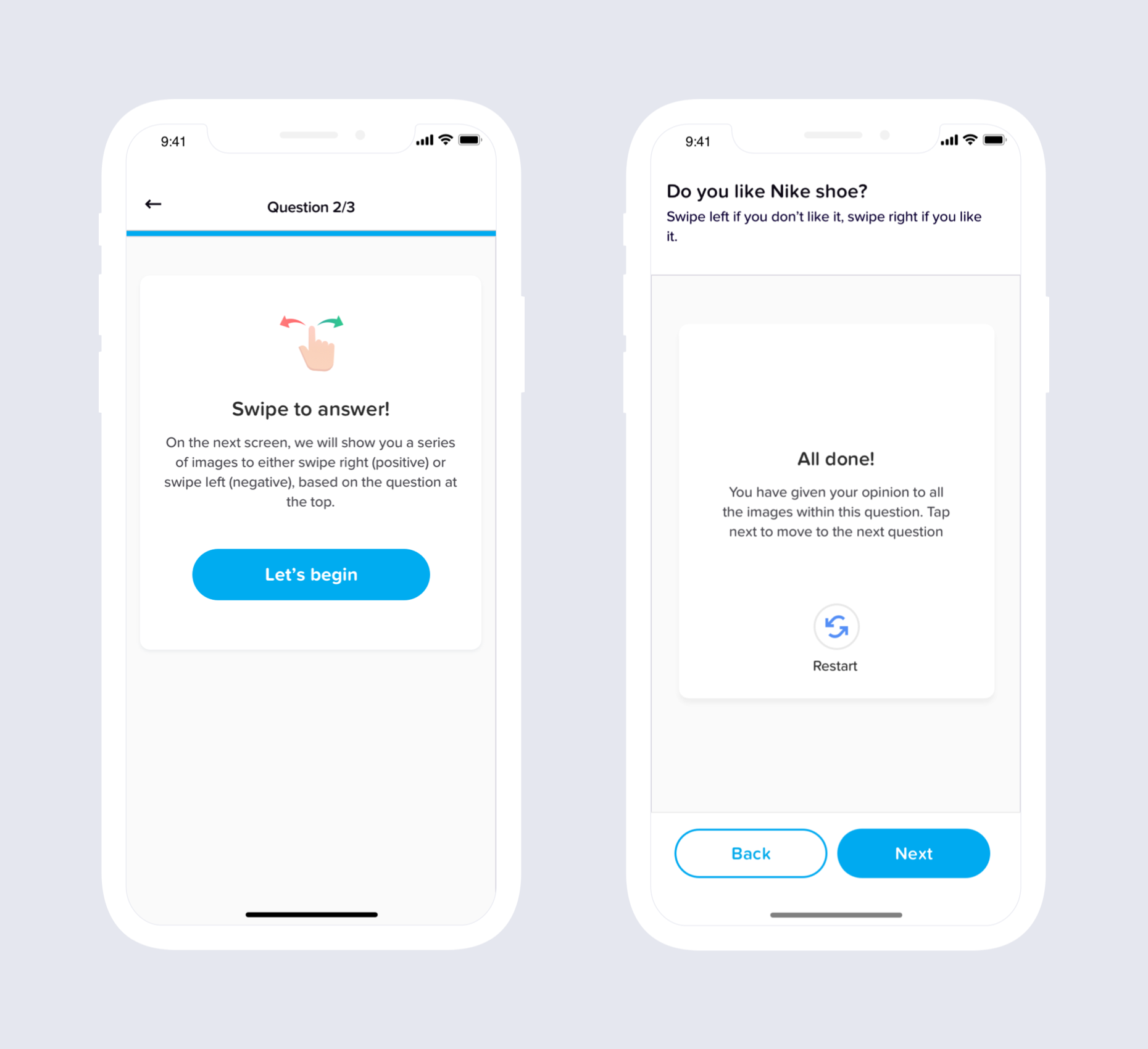
Based on all the solutions, I have designed few versions of the wireframe. I shared the wireframe with our product team to get some initial feedbacks. My team members were really happy to see the first version of the wireframes. They also give me suggestions, such as, the way I introduce the undo format, we can do it in simpler method.
Below is the interaction of the wireframe:
User Testing:
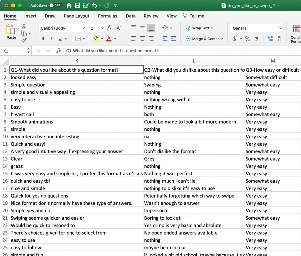
We have conducted a new survey inside our platform showing the wireframe video to our citizens. Total 731 citizens participated in that survey, and more than 95% of the citizens liked the idea and they found its very entertaining. However, they raised some questions, like, what if they don’t want to give the answer or they don’t know the answer. This question triggered us to introduce the N/A (Not applicable) option as answer. Below is a screenshot of users feedback about the feature.
UI Design:
Keeping the user feedback in mind I have designed some draft screens to show my team members. The team liked the visual style I introduced in the app which were reflecting the style of dating apps. I followed the dating apps style because they are fun and entertaining to use. Instead of only having the swiping functionality I have introduced the option to positive (like) and negative (dislike) button. So, when the user is tired to swipe, they can just tap and move to the next image. The team said it’s a great design decision. They also gave me some suggestions, like, in the tool tip screen, on the swiping icon I can make the left arrow red and right arrow green, unlike the way I created it with both arrow in green color. They also provided me some suggestions to improve the copy (text) of the design.
After taking the team feedback I iterated the design. I show the design to product team, development team and marketing team. Everyone was very happy with it. However, the development team put a restriction that the “Undo” function would work during the survey process, but once the user completes all questions then they cannot “Undo” the ending one, which means users can undo all image but not the very last one. Therefore, I had to come with another solution. So, I have introduced the “retake” functionality. This means, if the users complete all questions and what to undo, then they have to retake the whole survey again.
Interaction Design:
I have designed the interaction.
Testing with development team:
After completing the development process the whole team got together to test. Everyone was providing their feedback. There were some bug issues though. I found some minor design problems. I informed the lead developer about the errors. The development team fixed them.
Final Preview:
Results:
The design was able to reach its success metrics.
- Citizens really liked and enjoyed the new feature in the app.
- Our clients were also happy with this feature. They found, now they can understand user reaction about a particular image which helps them to get better customer insight.
What’s next?
In product design, problems and challenges always appear, and it needs to improve every time. As our citizens liked the feature therefore, we are planning to introduce “text” swiping feature, where the user will be able swipe a word or a sentence. We believe this feature would be a nice feature for the app. But before we finally move to that feature we need to ask our citizens and clients if they want it or not.