AI / Retail
Caper AI: World’s First AI-Powered Shopping Cart
Overview
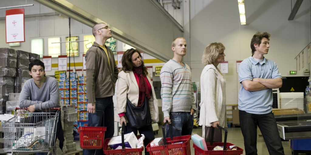
Study says, 86% of U.S. consumers have left a store due to long queues in the last 12 months (PR News Wire, 2018). With customers leaving empty handed, retailers are losing an estimated $38 billion in potential sales. It clearly indicates that there was something very wrong with the shopping stores. The main goal of Caper was to revolutionize the shopping experience in super stores and encourage the customers to come stores for shopping by making the store experience more attractive. Our team decided to use power of artificial intelligence in order to accomplish the goal.
Understand & Define Problem:
Interview
The team selected 50+ stores to take interview. We designed our questions in a way where user don’t just say yes or no, rather, we asked them descriptive questions. For Example, we asked the store owners and customers about their pain points that they face on a day-to-day basis. Based on their answers we found some valuable information. Among them, the most common problems were:
- Someone always needs to stay in the cash
- Scanning the items
- Too few open checkout
- Long wait in till
- Confusing store layout
- Hard to find items
- Wait for scan
We categorized these problems into 3 sections
1) Finding Items:
Finding items was a common problem for all customers. Some customers claimed they get so confused and forget what to buy.
2) Scan Items:
Owners and customers feel current scanning process is time consuming and its boring for waiting in the queue. Cashiers also get tired by serving so many customers manually.
3) Checkout:
Most of the customers agreed checkout process is a boring process for them. The same long queue and dealing with cashier are what they felt issues with checkout.
The team, including me, also conducted secondary research about the issues. We found similar issues are arising almost everywhere.
Competitor Research and Findings:
Here we found the giant Amazon is also trying to solve the same problem with Amazon Go service. But it requires entire stores to be outfitted with sensors and cameras. This is a very expensive approach and it can’t go into Whole Food, because, you’d have to tear down the entire store’s existing infrastructures to implement sensors and camera.
Product Solutions
Solution 1 - Finding items:
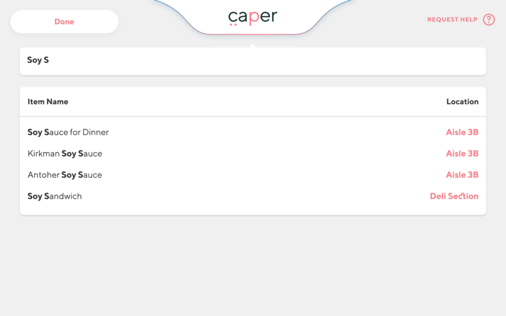
In grocery stores finding items is always a frustrating job. Some people just feel lost! Our goal was to make the searching process as easy as possible. Initial idea was, the user will search for an item in a device and it will tell which aisle the item is located.

But our team want to make the function more advanced and seamless. Therefore, we took one more step, and we decided to not only tell the aisle name but also show the location on the device with a map.

We went further and added the suggested items with location while the user is typing for any item.
Solution 2 – Scan Items:
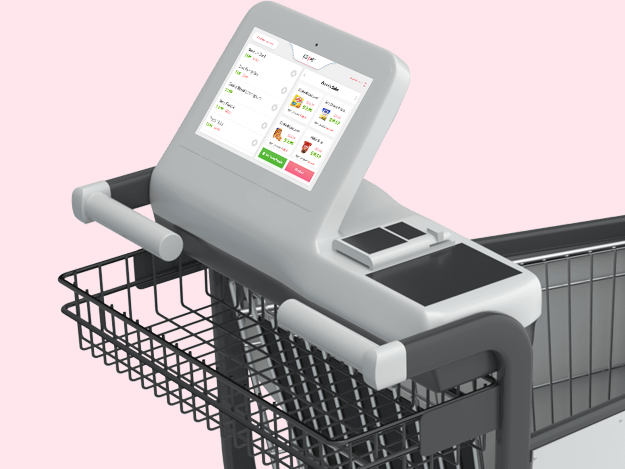
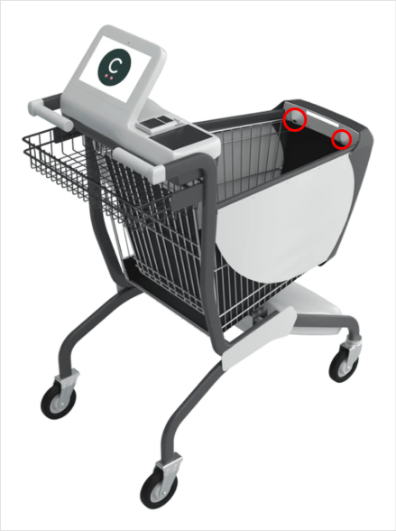
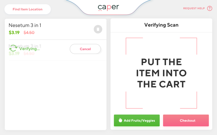
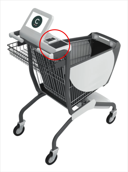
This one was a major pain point for all store owners and customers. The initial solutions were, there will be a scanner in the cart where the customers can scan and drop the products. But our main goal was to make the process more and more simple. After thinking more options, we finally decided to use lances that automatically scan products. So, the customers don’t need to be think for scanning. They just drop the product and go!

Solution 3 – Cashier-less Checkout:
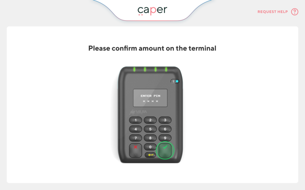
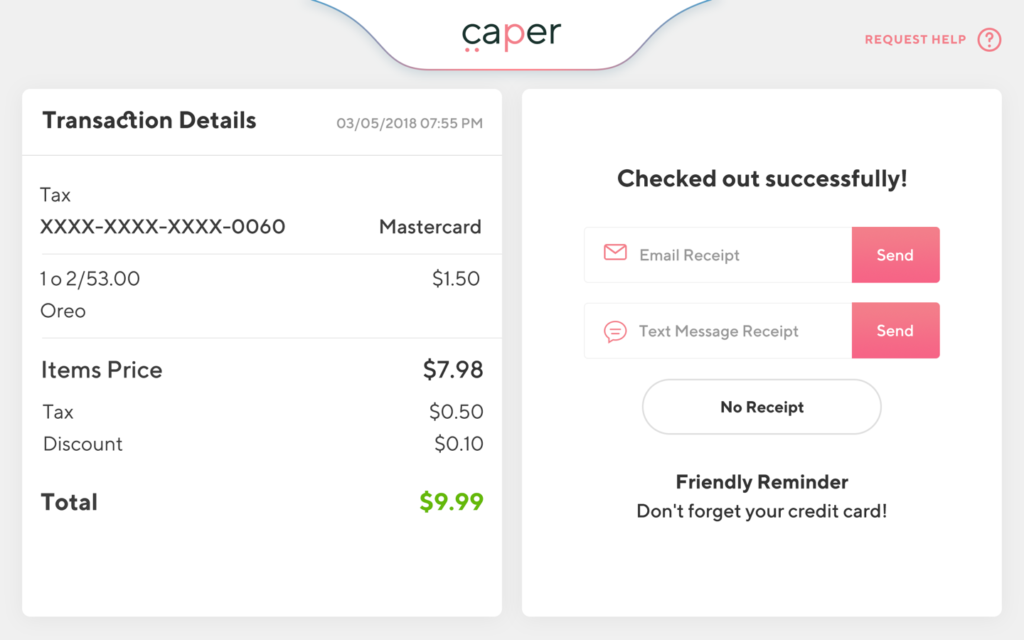
Facing this challenge was quite tough. The product goal was to shape the entire shopping experience in an innovative way. Like other two solutions, our plan was to provide immediate service to the customers. Because, waiting for the payment in the queue was most common pain point for the customers. And the only solution was, “Do It, Now!” In order to accomplish the challenge our team agreed to put the payment system in the shopping cart itself.
Extra Feature – Recommended Items:
Studied about shopper’s behavior says, to buy a typical item, the shopper takes 5 seconds. But for the item that not typical purchase, it takes 30 seconds or more. In shopping mood it’s a long time gap. It is the perfect time for Caper to push a recommendation or offer a coupon for a particular brand. Moreover, Caper can collect the heat maps of a customer shopping journey—to understand how customers walk through the store. It helps the system to recommend more accurate item to the customers.
Final Solution:
So, the ultimate solution is, a shopping cart with an android tab attached with it where the user can search for any item, find the item using the built-in map of the store in the device. The lances attached in the cart can automatically scan the item when user put anything inside of it. The cart also shows recommended items to the customers. Finally, user can pay and checkout from the cart.
Design & Prototype
UX Design:
Here you come with the role of UX. I just added some prominent features of the system below:
- It shows the location of item by map
- Accepts the data from the lances
- Lists the items that added to the cart
- Sends the payment data to Card Reader
- Gives item recommendation to the customers and many more
Now, it’s clear that we are in the way to achieve our customer and business goal by using the device attached with the cart. Therefore, putting more effort in the UX is crucial to make the product successful.
We went through the agile process of process of UX and UI. Based on the pain points of our research, we developed the first version of wireframe. Then, we went back and conducted 30 different user tests on the UX, getting their feedback and iterate over and over again. Our product director and UX designer were working closely for making the wireframe of the app. I was also helping them from my side.
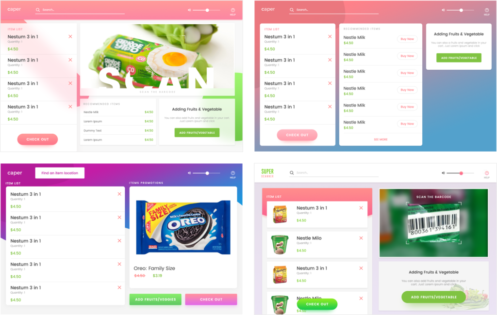
Here are some parts of the wireframe:
UI Design:
I was completely responsible to design the UI of the system. Though I knew the background study for the system, still, I went back and studied the background information again. Asked the questions to the director where I needed to be clear. After all the answers I started to design the high-fidelity interface. The process was, design a set of screens > Get team feedback > Update design > User Testing > Iterate > Move to the next sets.
Designing the initial screens were taking more time, because, I was making couple of versions for a single screen. It was the time when I was testing the design with various typography, color, blocks, layout, etc.
Below are some versions of the very first screen “Get Started”
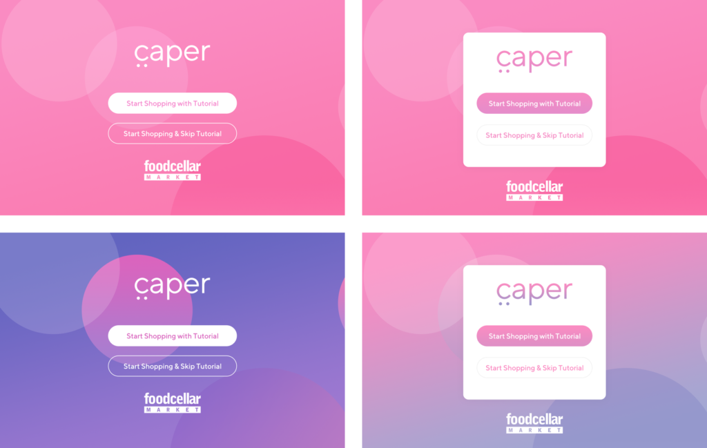
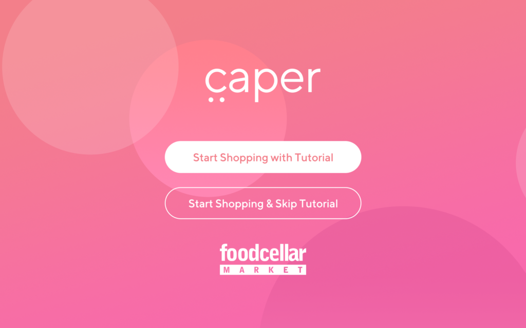
We finally decided to go with below screen as the final “Get Started”. Because it less confusing and more focused on get started, the colors look playful and match with our branding. Also, if anyone wants to see the tutorials they can just tap and see before using it.
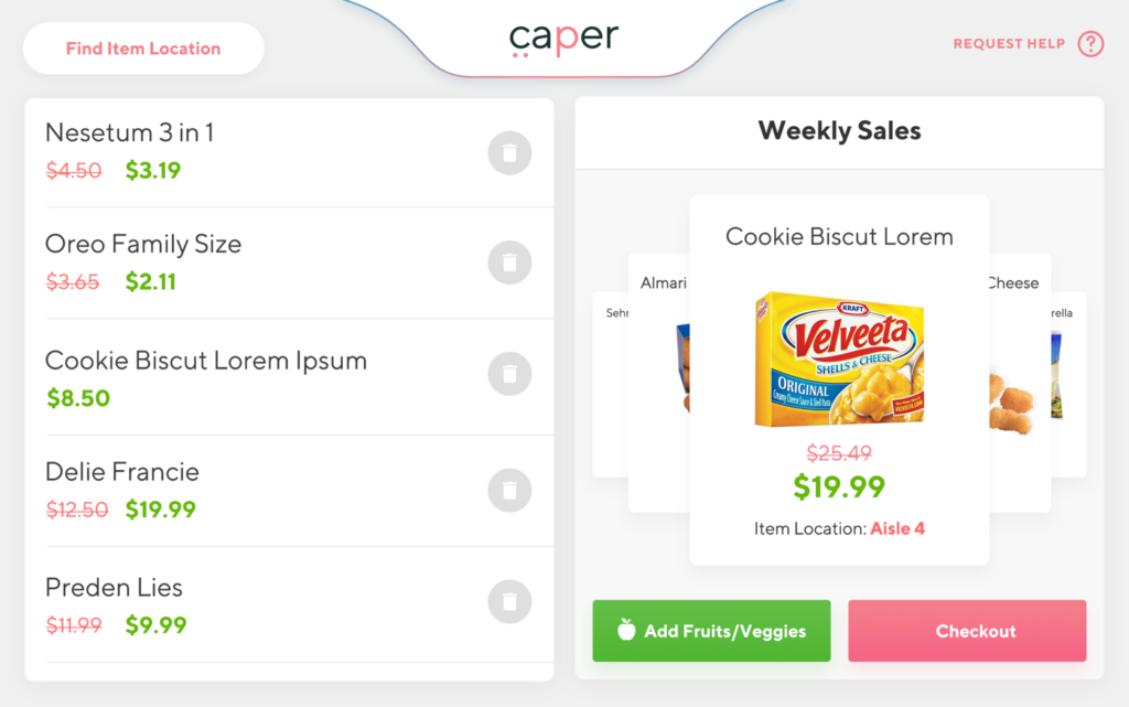
Here is another example of having couple of versions of one screen. It’s the Item List and Recommendation screen. The main issue was having the background color. I tried various fancy and standard colors to find the best solutions. Below are some of the background I tried:
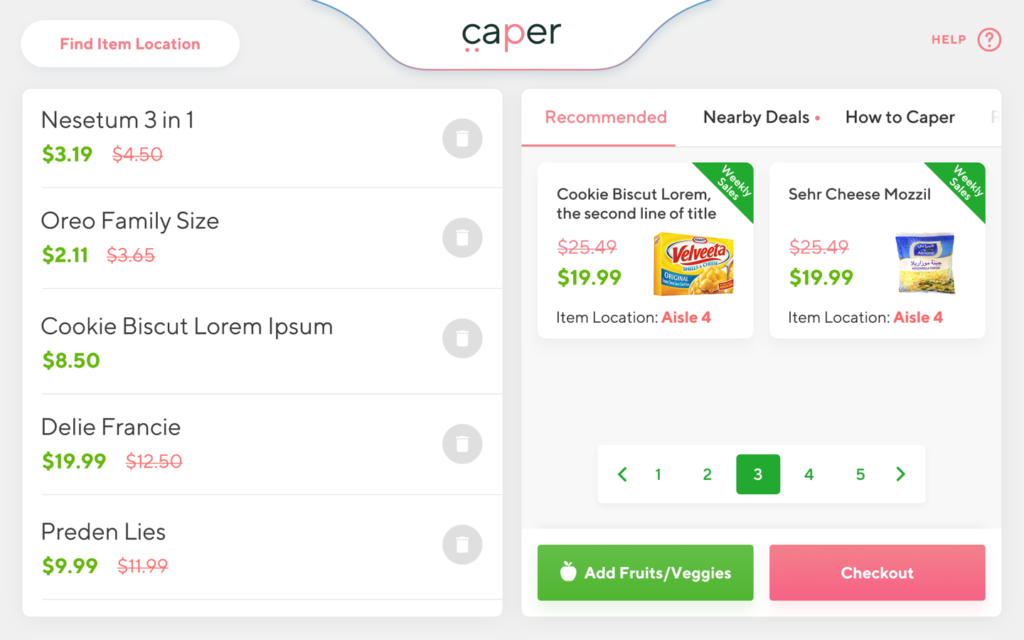
After having discussion with the team and store owners. We finalized the below version of the Item List page would fit best. Because, it was easier to navigate, and the look was standard.
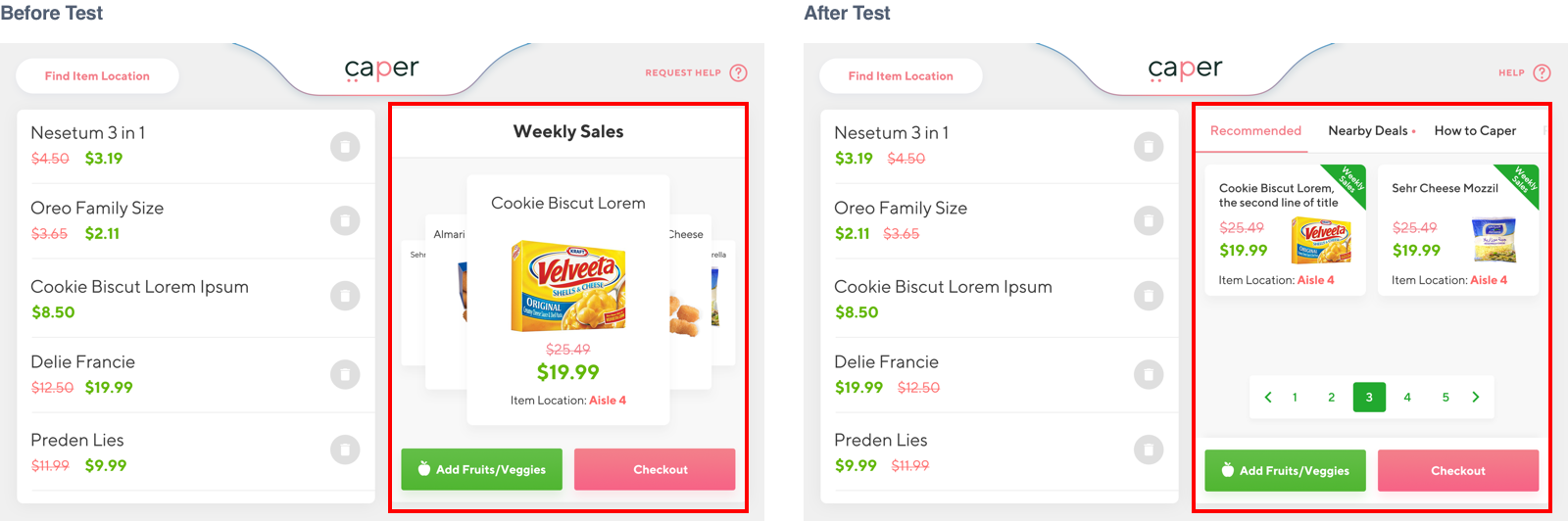
User Testing and Iteration
In product design user testing and iteration are crucial part. For Caper—the smart cart, after completing the first set of screens our team conducted various user testing. We didn’t just ask what you think, rather, we asked some in depth questions. Such as, how someone deal with the “Recommended Items” section? What’s the pain point there when they try to navigate that particular section?
The answers were quite surprising. Many users were not preferring the layout of “Recommended Items” section, and they pointed out some critical issues, such as the previous version was showing one item at a time and user had to swipe the screen to see the other items. We took the issues in account and updated them.
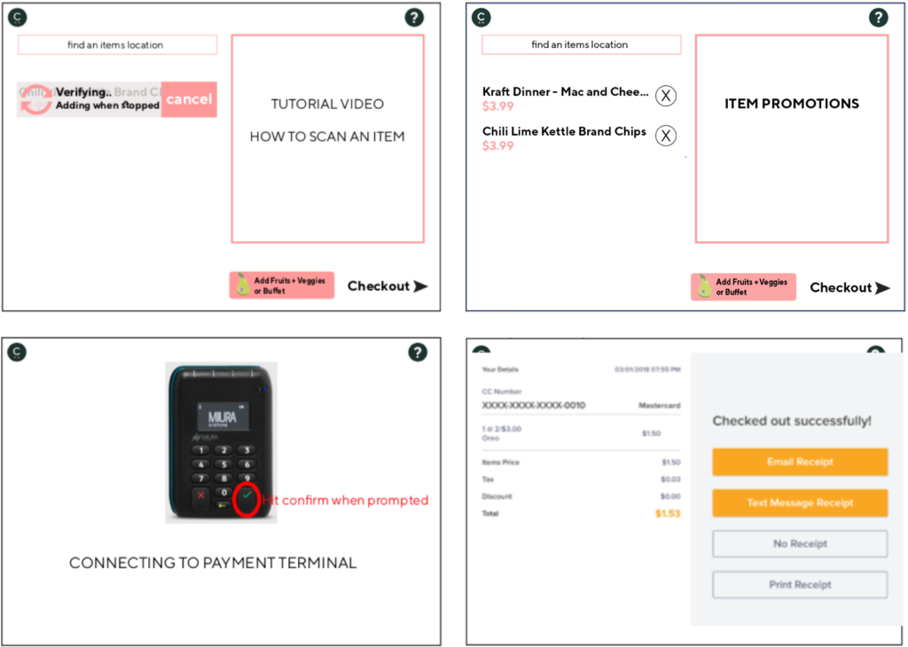
Below are the before test and after test version of “Recommended Item” section of the system.
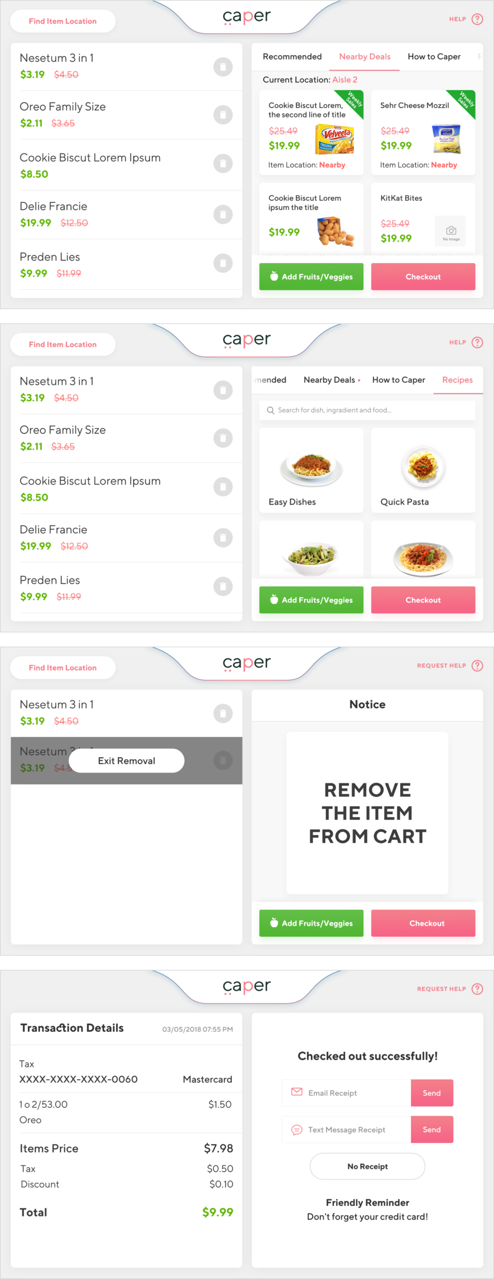
Some More Screenshots
There were more than 60 screens for the app. I have added some of them below.
Watch the Video
YouTube Link:
Results:
Caper gained huge success in its early age.
- According to Forbes (2019), Caper is the world first AI-Powered Shopping Cart
- Business Insider & Tech Crush claimed, Caper gained $13 millions of investments till now.
Featured In

What’s Next?
The Caper team started to grow completely. The company started to hire more and more employees to make the product better for the future. We are still working on it to improve the system. I am also contributing from my end in design. The company is planning to redesign the app again in near future.