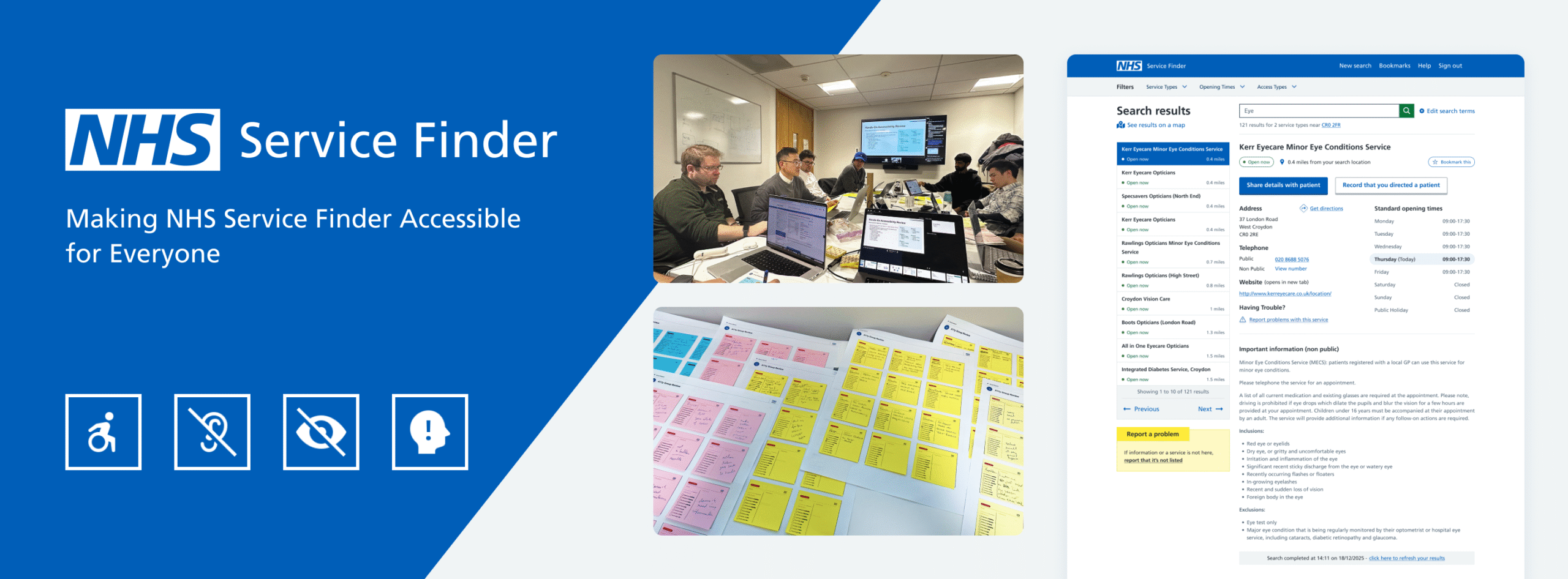
Making NHS Service Finder Accessible for Everyone
Overview:
The National Health Service (NHS) in the UK is one of the world’s largest publicly funded health services and one of the largest employers globally, providing care that is free at the point of use. NHS Service Finder sits within this ecosystem, supporting frontline clinicians, care providers, and emergency staff to quickly locate the most appropriate NHS services for patients, often in high‑pressure environments.
In this project, I led an end‑to‑end accessibility initiative to align the platform with WCAG 2.2 AA and NHS digital accessibility standards, with a clear goal: make Service Finder more usable and equitable for every user, regardless of their access needs.
Context and my role:
I worked as a Senior Product & Interaction Designer (via Accenture) embedded in the NHS Service Finder team, specialising in accessibility and UX. My responsibility was not just to “fix” issues, but to define a repeatable way for the team to design, build, and ship accessible features by default.
My Roles:
I facilitated brainstorming and team alignment, supported user research and insight synthesis, led UX and UI design across web and mobile, and collaborated closely with developers on implementation.
Duration:
12 Weeks
Deliverables Scope:
Accessibility audit across key journeys, pages, and components
Updated wireframes and UI designs to meet WCAG 2.2 AA
Detailed handover documentation and Jira tickets for developers
Problem Statement:
Service Finder had grown over time without a consistent accessibility practice, which led to gaps in compliance and usability for people with access needs. Critical journeys like search and service details were not consistently usable with keyboard, screen reader, or zoom at 200%, creating both regulatory and user‑experience risks.
- Limited shared understanding of accessibility in the team
- Reliance on ad‑hoc checks rather than systematic audits
- Risk of non‑compliance with public‑sector accessibility regulations
Objective:
I set a clear objective so the team knew what success looked like.
- Ensure all design deliverables are WCAG 2.2 AA compliant and aligned with NHS digital accessibility guidance.
- Embed accessibility into the team’s everyday practice rather than treat it as a one‑off exercise.
Practically, this meant bringing all user journeys up to AA level, reducing barriers for assistive‑tech users, and creating a prioritised backlog for implementation.
Building the foundations:
Translating NHS and WCAG into team language
I started by grounding everyone in the NHS and WCAG standards, then translated them into actionable guidance for Service Finder.
- Mapped NHS digital accessibility expectations to our product context.
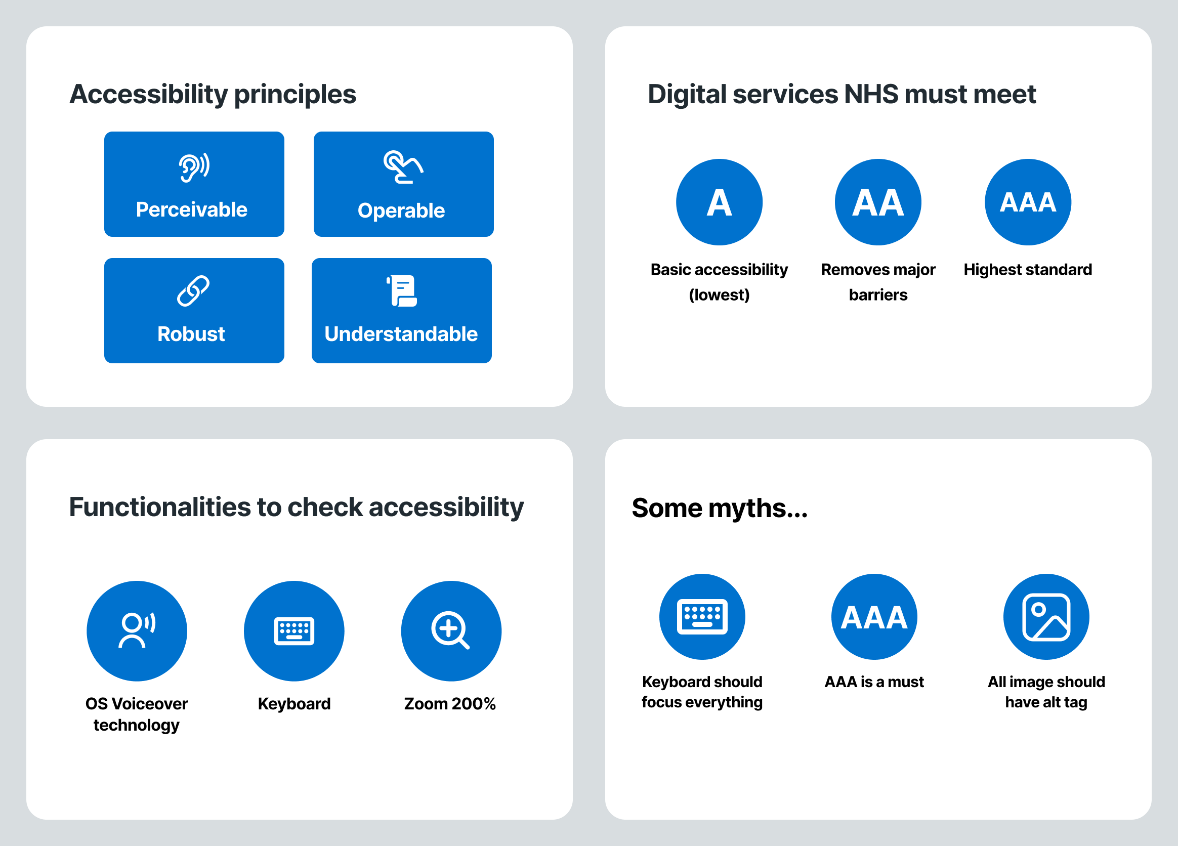
- Introduced the POUR principles (Perceivable, Operable, Understandable, Robust) with concrete examples taken from existing screens.
I created a lightweight toolkit for the team:
- NHS accessibility guideline references and posters
- A11y checklist tailored to Service Finder
- Simple breakdown of A vs AA vs AAA, including what is required, what is realistic, and what is “nice to have”
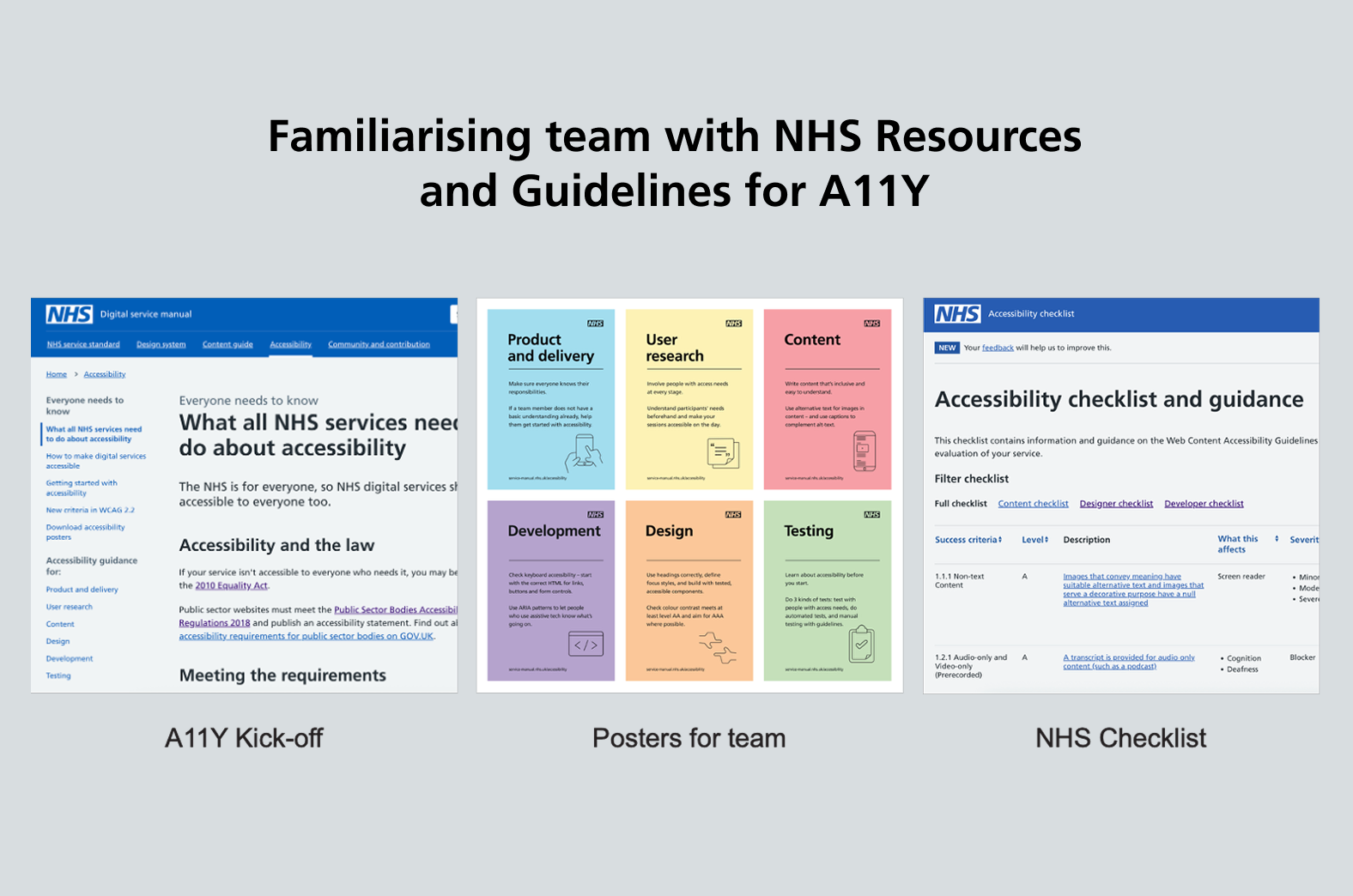
Team onboarding: myths, tools, and practical checks
To get the team on the same page, I ran an onboarding session focused on practicality over theory.
I covered:
- Accessibility principles through real product examples
- Common myths, such as “every single image must have an alt tag” or “everything must achieve AAA” and clarified what good looks like in practice.
- Practical checks using:
- Keyboard‑only navigation
- Zoom at 200%
- VoiceOver / screen readers
I also introduced the core tools we would use:
- Browser extensions: Silktide, WAVE, Lighthouse for baseline checks.
- Manual verification to catch anything automated tools can’t see.
Accessibility audit:
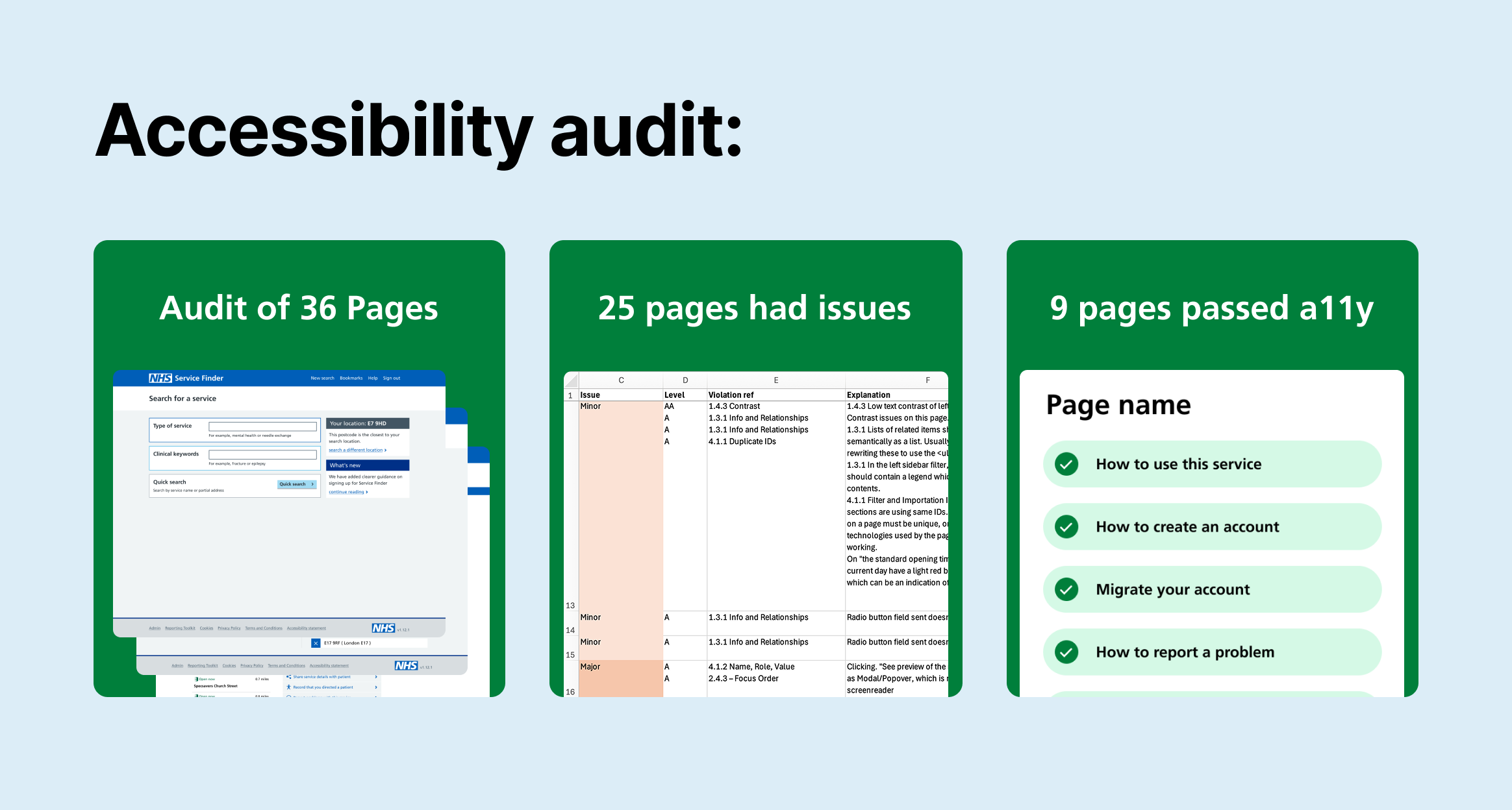
Systematic audit across 36 pages:
I led a structured audit to understand the current state before proposing solutions.
- Scope: 36 key pages across web and mobile experiences
- Findings:
- 9 pages passed the accessibility checks
- 25 pages had one or more issues that needed remediation
Using Silktide, WAVE, and Lighthouse, I identified issues such as insufficient contrast, missing or incorrect semantics, and poor focus handling. I combined these automated findings with manual testing for keyboard, zoom, and screen readers to build a complete picture.
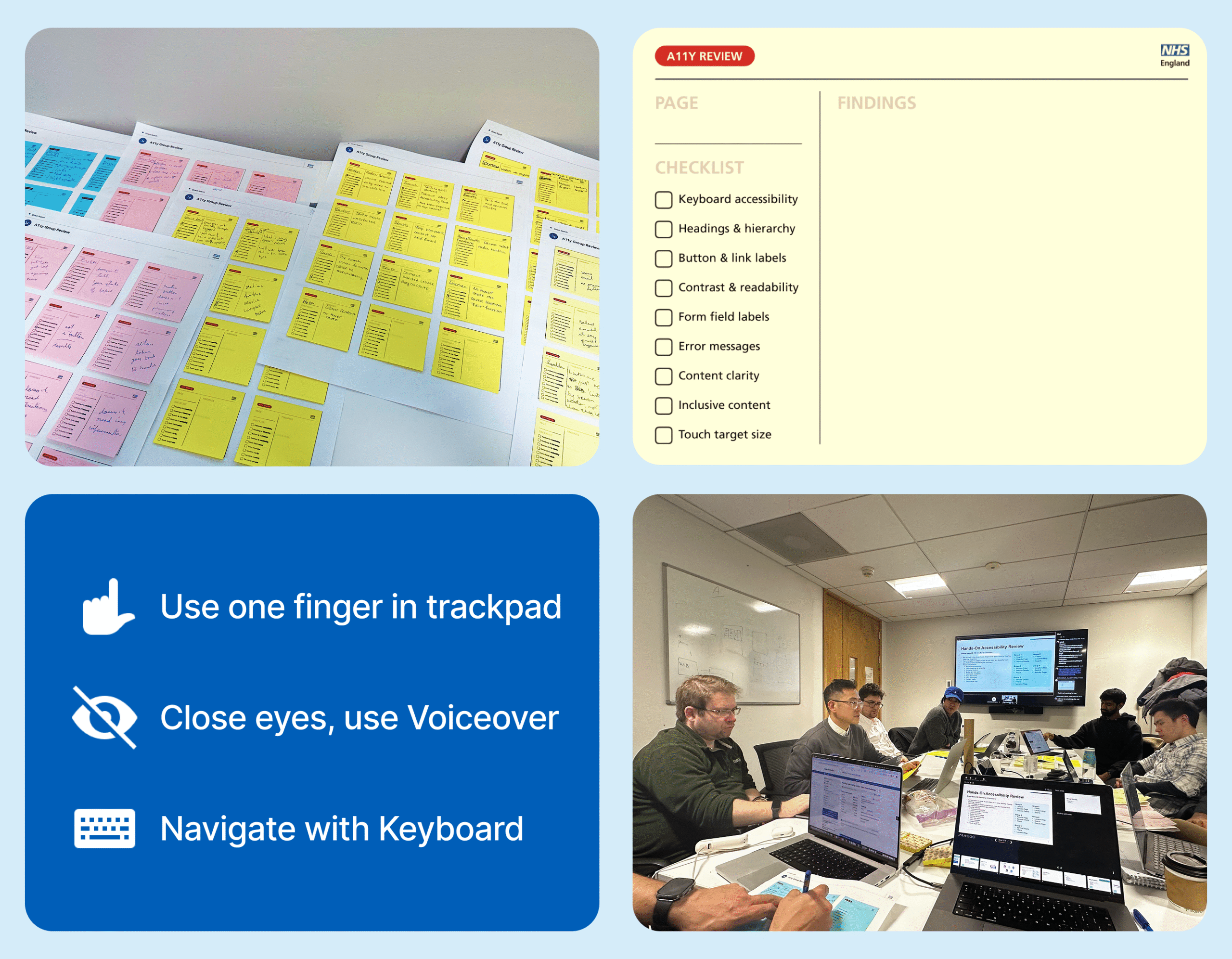
Empathy‑driven in‑person workshop
To move accessibility out of the theoretical space, I designed an in‑person workshop that put the team in users’ shoes.
Each participant or group was asked to:
- Navigate a journey with eyes closed using VoiceOver, and write down every friction point.
- Use one finger on laptop trackpad, imagining limited mobility, to complete a task.
- Navigate one key flow using keyboard only.
- Complete a full journey on a mobile device and note issues.
All findings went on sticky notes, tagged to features and flows. This surfaced issues like confusing focus order and unannounced errors that automated tools had not flagged.
From issues to actionable work:
Prioritisation with engineering: impact vs effort
After consolidating findings from tools, manual checks, and the workshop, I partnered with developers to make the backlog actionable.
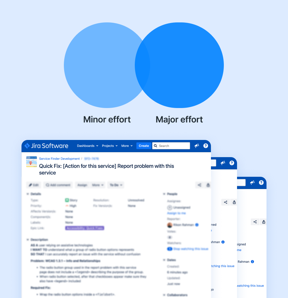
We classified each issue by:
- User impact (critical / high / medium / low)
- Implementation effort (minor / major), validated with engineering to ensure feasibility
This step was key to building trust in the backlog and making sure the work reflected both user need and technical realities.
From there, I:
- Created Jira epics for minor effort and major effort accessibility work
- Broke down issues into detailed tickets including:
- Description of the problem
- WCAG 2.2 reference
- Before/after behaviour expectations
- Links to updated designs where relevant
First wave: low‑effort, high‑value fixes
The first implementation wave focused on fast, high‑impact changes.
Examples of what we tackled:
- Improving colour contrast for critical UI elements (buttons, links, text) to meet AA ratios.
- Fixing heading structures and landmarks so screen readers could interpret pages correctly.
- Adding clear labels and legends to grouped form elements to support users who rely on non‑visual hints.
I provided updated UI specs, reviewed builds against WCAG criteria, and ensured changes improved real usability, not just automated scores.
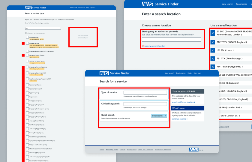
Second wave: design‑led improvements (search as a case)
Some issues required deeper design and in some cases backend collaboration. The clearest example was search.
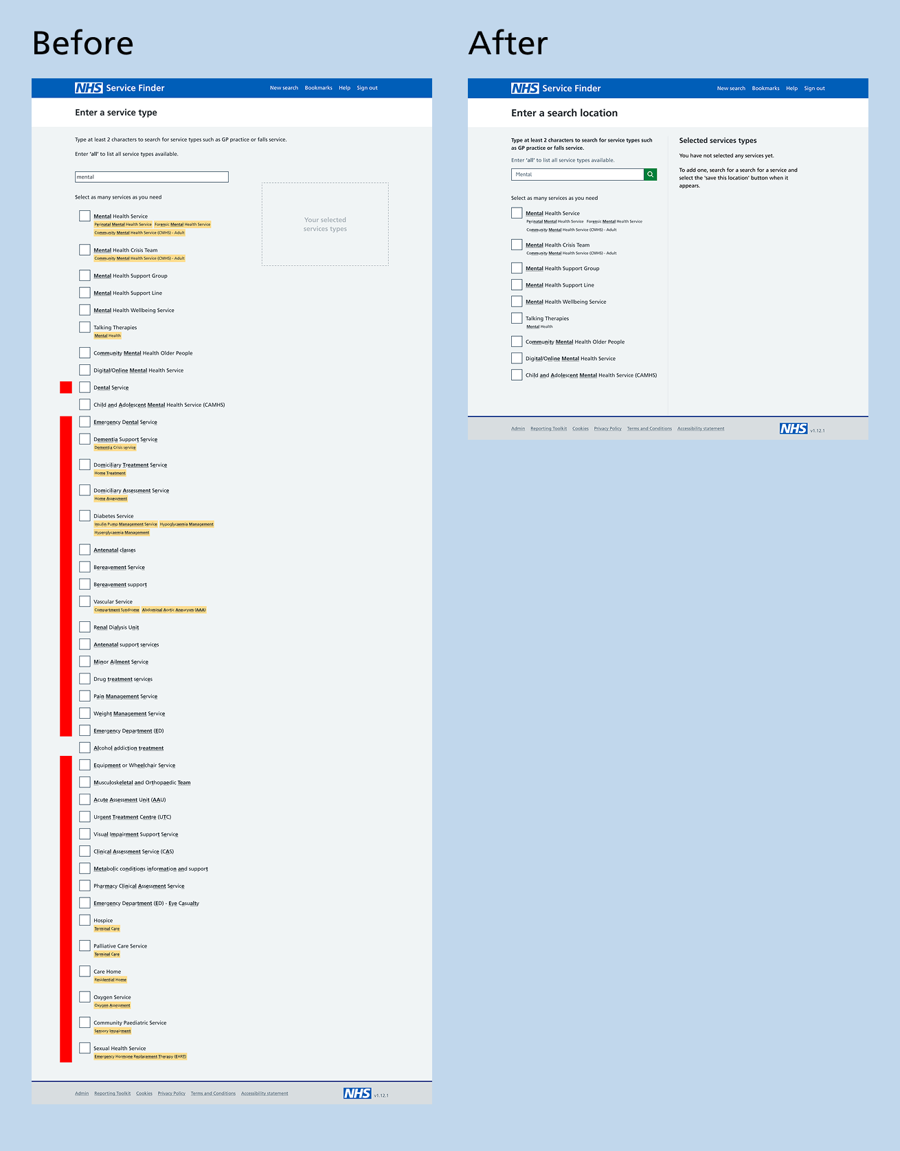
The original search used fuzzy matching, returning results based on loose character matches:
- Searching for “mental” could return “dental” or unrelated services, making around 90–93% of results irrelevant and noisy.
- For assistive‑tech users, this meant longer lists to wade through, more cognitive load, and higher risk of missing the right service.
My approach:
- Investigated why fuzzy search had been implemented (technical constraints, legacy decisions, policy requirements).
- Benchmarked against other accessible search patterns in healthcare and public‑sector services.
- Proposed a more precise, intent‑driven search that:
- Prioritises relevance
- Uses clearer result labels and grouping
- Handles “no result” states transparently
I designed updated flows, validated them with users (e.g. clinicians), and then prepared detailed specs and acceptance criteria for engineering. This reframed search from “technically working” to reliably usable and accessible.
Outcomes:
This phase focused on raising the baseline accessibility of NHS Service Finder while embedding sustainable practices for future delivery. The result was a more inclusive, efficient experience for users and a more confident, accessibility-aware team.
- 36 pages remediated to WCAG 2.2 AA, with all issues resolved or assigned to clear and long-term ownership
- 30–35% faster task completion for users of assistive technologies, with fewer errors and reduced cognitive load
- 20–25% quicker service discovery reported by frontline staff in key search and selection journeys
- User testing confirmed overall usability improvements for all users after the implementation of accessibility-compliant design