Healthcare / Public Sector

Designing secure access and accessible service journeys for NHS Service Finder

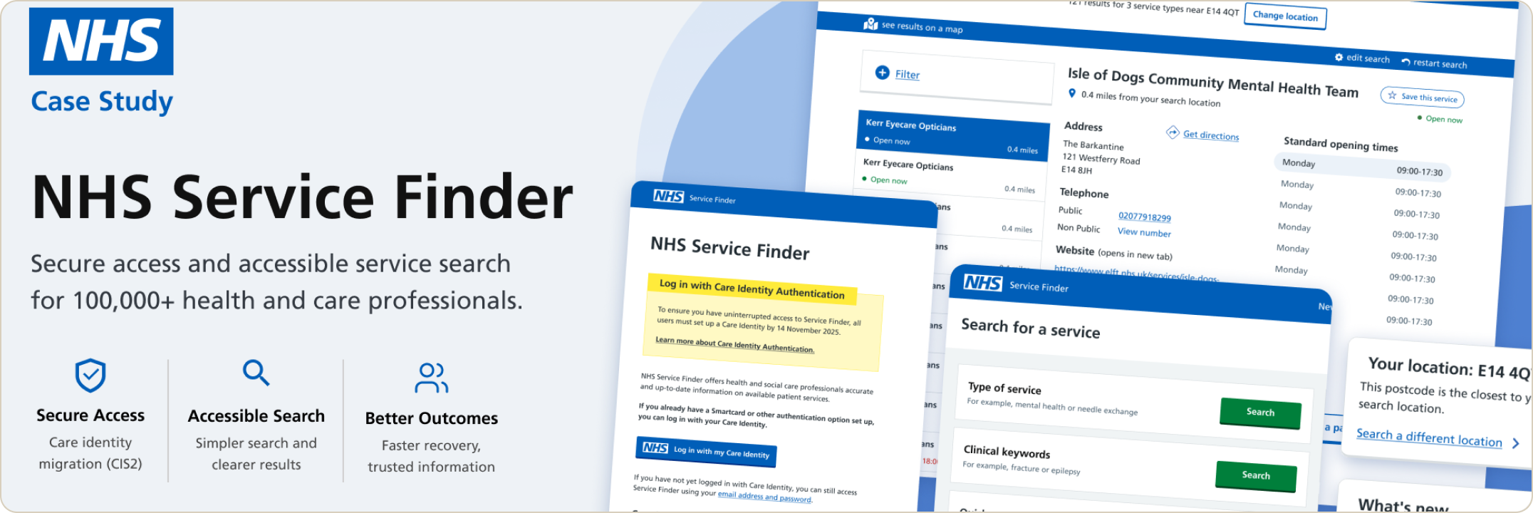
I led UX for a national Service Finder modernisation, helping move 100,000+ health and care professionals from legacy email/password login toward Care Identity Authentication (CIS2), while improving accessibility across critical service journeys. This was not only a login migration — it was a service modernisation across identity, user readiness, account states, accessibility barriers, and local component debt.

Role
Senior UX & Interaction Designer
Timeline
June 2025 – April 2026
Product
NHS Service Finder
Scale
100,000+ health and care professionals

Impact at a glance

  • 100k+

    Health and care professionals supported across NHS services

  • 94%

    Completed the migration without contacting support in the first week

  • 2.4d → now

    Onboarding reduced to near real time using trusted organisation and role data

  • 36

    Key pages audited across web and mobile — 25 pages had accessibility issues

  • 35%

    Faster task completion for users with accessibility needs in internal testing

  • NHS DS

    Design System alignment used as a sustainable accessibility strategy, not a visual refresh

Product context

What is NHS Service Finder?

The product

NHS Service Finder is used by health and care professionals to find accurate, up-to-date information about available services in a specific location. Users may be looking for urgent treatment centres, pharmacies, mental health support, referral routes, eligibility criteria, opening times, or contact details.

These users often work under pressure. They need to find the right service quickly, trust the information, and recover easily when something goes wrong. This is not a general public-facing search tool — it supports professional workflows where accuracy, speed, trust, and accessibility matter.

Service Finder supports time-sensitive decisions by helping health and care professionals find relevant services, referral routes, eligibility details, and availability information.

The challenge

Five connected service journey problems

  1. 01

    Legacy login

  2. 02

    Account states

  3. 03

    CIS2 handoff

  4. 04

    Accessibility gaps

  5. 05

    Component debt

  • 01

    Legacy login created a behaviour-change challenge

    Users relied on familiar email/password login. Moving to Care Identity improved security, but required users to change an established behaviour under time pressure. Users had mixed digital confidence and many needed repeated guidance and reassurance.

  • 02

    Users entered from multiple account contexts

    New users, existing users, Cognito users, and mismatched accounts each needed different routes, logic, and recovery paths. Each context required a distinct journey and a clear path when something went wrong.

  • 03

    Care Identity setup happened outside Service Finder

    Setup opened on a separate NHS platform in a new tab and required users to return manually. Login redirected users back automatically after MFA. This technically correct behaviour was confusing for users.

  • 04

    Accessibility issues existed at multiple levels

    Some issues were minor and could be fixed quickly. Others affected interaction behaviour, page hierarchy, keyboard order, search flows, and repeated patterns — requiring design work, not just surface fixes.

  • 05

    The local component library became a constraint

    Service Finder used a local React library that had drifted from NHS Design System standards, creating inconsistent UI patterns, accessibility gaps, duplication, and growing maintenance overhead.

    “These issues were connected: the identity migration exposed account-state complexity, the accessibility audit exposed structural barriers, and those barriers exposed the limits of the local component library.”

My role

Senior UX & Interaction Designer

I led UX across secure access, accessibility, search, and design system alignment — making complex constraints understandable for users, developers, product stakeholders, and clinical teams.

  • CIS2 Migration

    • Mapped login journeys and account states
    • Designed staged migration messaging
    • Aligned in-product experience with wider comms
    • Defined recovery paths and access flows
  • Accessibility

    • Audited 36 key pages across web and mobile
    • Prioritised quick fixes and structural issues
    • Translated findings into developer-ready tickets
    • Redesigned critical accessibility barriers
  • Design System

    • Audited local patterns against NHS Design System
    • Defined Match / Minor Change / Does Not Match
    • Challenged patching in favour of system-level alignment
  • Interaction Craft

    • Redesigned dense search results for scannability
    • Improved structure, hierarchy, and interaction clarity
    • Designed search patterns for different intents and devices

Main contribution: Making complex identity, accessibility, and design system constraints understandable for users, developers, product stakeholders, and clinical teams.

01

Chapter

Care Identity migration

Designing for multiple user and account contexts

One migration, many different starting points

Why this mattered

The Care Identity migration was not a single linear flow. Users arrived with different account histories and levels of readiness. A new user without Care Identity needed a different route from an existing Service Finder user migrating account data. A user with an email mismatch needed a different path again. A user blocked before login still needed help.

Without this mapping, users could take the wrong route: creating a new account instead of migrating, failing to link accounts because emails did not match, or being blocked before reaching help.

Collaboration: I worked with a service designer to map the key account states. My focus was translating those states into clear product journeys, interactions, guidance, and recovery paths.

User state UX risk Designed route
New user without Care Identity Abandons at cross-platform boundary Setup guidance + return instructions
New user with Care Identity Creates duplicate account Detection → MFA → account creation
Existing user with Care Identity Unsure whether to log in or migrate Migration route + email linking
User on legacy Cognito login Gets locked out without preparation Staged warnings → interrupt → decommission
User with email mismatch Thinks account is permanently locked Manual email step + recovery route
User needing approval Assumes something is broken Approval state + timeline + next steps
User needing help before login Blocked before reaching support Help available without authentication

Designing the transition, not just the login

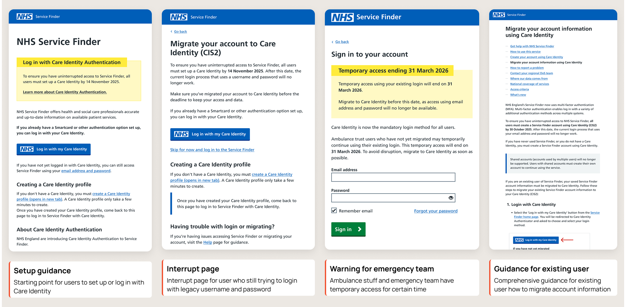
Staged in-product migration messages

The challenge

The hardest part of the migration was not the authentication technology. It was helping a large, busy, mixed-confidence user base change a familiar behaviour. My role was to align the in-product experience with the wider communication plan — landing page messages, login warnings, interrupt pages, password-reset warnings, help pages, and final decommissioning states.

The staged approach gave users repeated chances to understand, prepare, act, and recover. In the first week of migration, 94% of users completed the process without contacting support.

Collaboration: I worked with the content designer on every in-product message. They owned wording and tone; I owned placement, logic, and recovery flows. We reviewed each stage together before sprint delivery.

Migration stages

Owned by me Wider team Aligned with me
  1. Awareness

    Early phase

    • Landing page banner
    • Login soft prompt
    • Email announcement
    • Webinar invitation
  2. Preparation

    Mid phase

    • What is Care Identity?
    • How to set up guide
    • Before-you-start page
    • Email: step-by-step
    • Webinar 1 + 2
  3. Deadline

    Oct 2025

    • Warning banner on login
    • Password reset warning
    • Help pages updated
    • Email: deadline reminder
  4. Friction

    Nov 2025

    • Interrupt page
    • Skip for now option
    • Having trouble? link
  5. Decommission

    Nov 2025+

    • Legacy login removed
    • CIS2-only landing state
    • Support before login
  6. Sunset

    Mar 2026

    • Ambulance trust warning
    • Temp access ending 31 Mar
    • Email to trust users

Protecting emergency access during winter pressure

Security versus clinical continuity

The tradeoff

From a security standpoint, the cleanest option was to move everyone to Care Identity and remove the old login. But the timing overlapped with winter pressure, when urgent and emergency care services face increased demand.

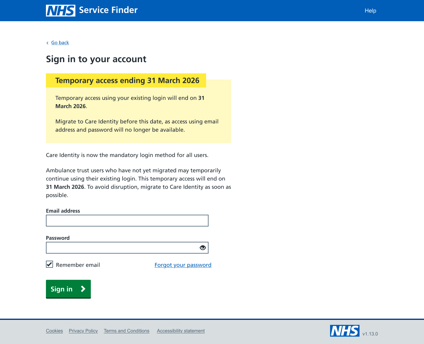
I worked with engineering to use Ambulance Trust ODS codes as an eligibility rule — recognising users linked to ambulance trusts and routing them through a temporary safe path. The exception was limited, temporary, intentional, and based on clinical risk, not convenience.

Authentication decision flow

User attempts login

Can use Care Identity?

Yes

Care Identity MFA

Access granted

No / unclear

Check ODS code

Amb. trust → temp route

Until 31 Mar 2026

Other

Support / recovery

Help available before login

Making the external handoff understandable and recoverable

Setup vs login: two different handoff behaviours

The problem

Care Identity was owned by another national team. Setup and login behaved differently: setup opened in a new tab and required users to return manually; login opened in the same tab and returned users automatically after MFA. This was technically correct, but confusing.

Working with a content designer, I made the handoff explicit before users left Service Finder — explaining where they were going, why, whether they needed to return manually, and what to do if setup or login failed. A key decision was making Help available before login, so users blocked before authentication could still get support.

Care Identity setup

  1. User begins setup from Service Finder Before-you-start guidance explains what will happen
  2. Care Identity opens in a new tab Explicitly told a new tab will open and why
  3. User completes MFA and account creation
  4. User must return to Service Finder manually Guidance explains return steps before they leave
  5. User logs in with new Care Identity credentials

Recovery states — login failure scenarios

  • Failed MFA

    Your authentication code didn’t work

    The code may have expired, or your authenticator app may not be synced. This is common and doesn’t mean your account is locked.

    • Try again
    • Request a new code
    • Contact local IT
  • Incomplete setup

    Your Care Identity setup isn’t finished

    You started setting up Care Identity but didn’t complete all steps. Return to finish, then come back and log in.

    • Return to Care Identity setup
    • Get help
  • Email or role mismatch

    We couldn’t match your accounts

    The email or role on your Care Identity account differs from your Service Finder account. You can update or contact support to link them manually.

    • Update email
    • Contact support
  • Missing organisation data

    We couldn’t verify your access level

    Your organisation or role wasn’t found in Care Identity. This may need to be added by your organisation’s administrator before access can be granted.

    • Contact your organisation
    • Request support

Supporting flow: organisation and role verification

Designing the professional information journey

The design work

Care Identity did more than authenticate users. It also created an opportunity to use trusted organisation and role data to reduce manual access checks.

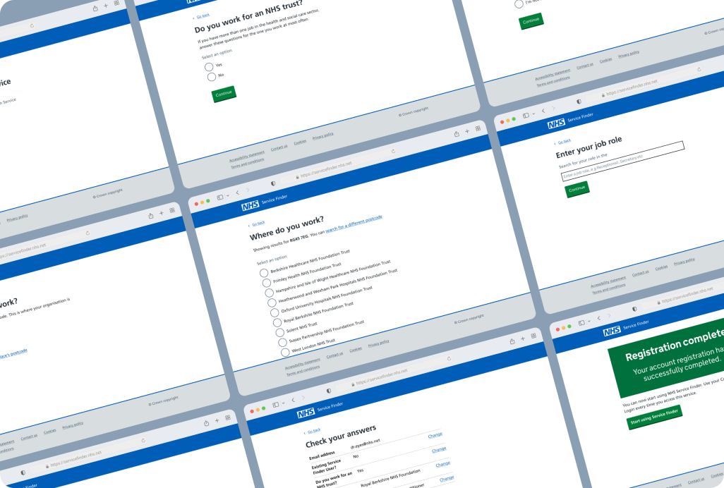
As part of the migration, I designed the Service Finder-side journey for users who needed to provide or confirm professional information, organisation details, and role data before access could be granted. This helped the service route users more clearly:

  • eligible users could continue with less manual intervention,
  • users with missing or unclear data were guided to approval or support,
  • users understood why extra information was needed before accessing the service.

The goal was to avoid asking users to manually re-enter information the system could already verify through trusted identity data.

Supporting impact

Manual onboarding previously took an average of 2.4 days. Using trusted organisation and role data helped reduce access time to near real time for eligible users.

02

Chapter

Accessibility audit and prioritisation

From leadership priority to service-wide audit

36 pages, 25 issues, two types of problem

The approach

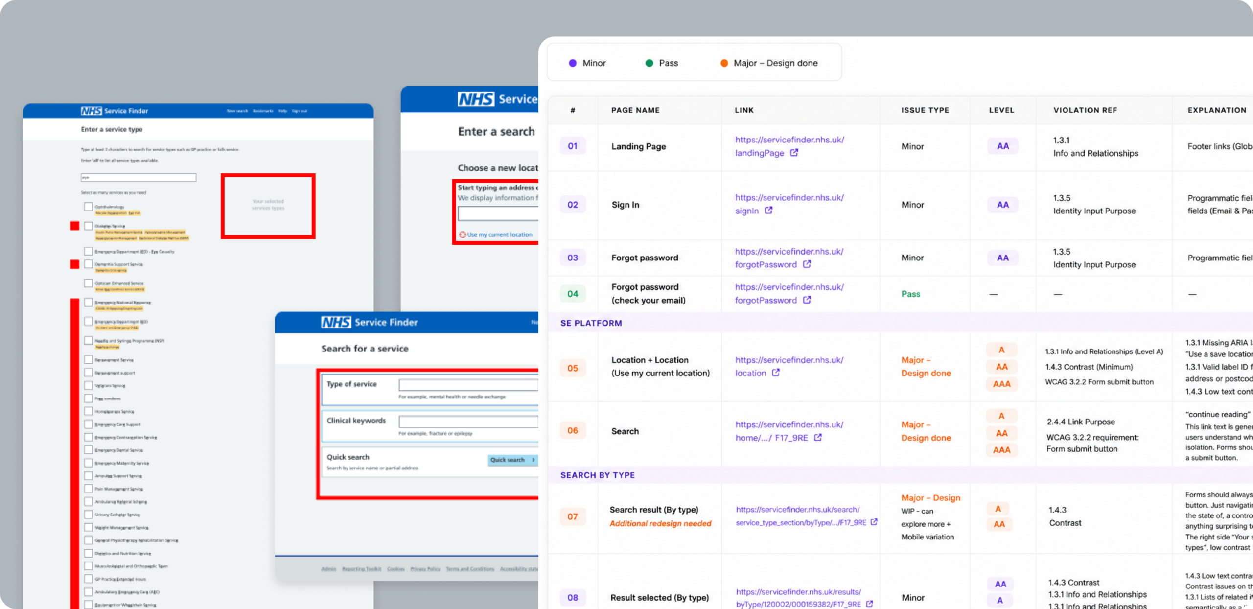
After the Care Identity migration, accessibility surfaced as the next priority across leadership, product, design, and engineering. I started with a service-wide audit across 36 key pages on web and mobile. 25 pages had accessibility issues.

I classified issues as quick fixes (labels, contrast, helper text, small focus-state issues, semantic structure) or structural issues (search behaviour, page hierarchy, keyboard order, form behaviour, no-results recovery, repeated component patterns). This allowed quick fixes to move fast while structural issues were redesigned properly rather than patched.

  • 36

    Pages audited web + mobile

  • 25

    Pages with issues

  • 2

    Issue types: quick fixes + structural

  • WCAG AA

    Compliance target across all screens

Issue classification

Quick fixes

Labels · helper text · colour contrast · small focus states · semantic structure · content clarity

Structural issues

Search auto-navigation · missing submit actions · incorrect focus order · unclear link purpose · dense result hierarchy · repeated component patterns

Turning findings into developer-ready work

From audit spreadsheet to actionable Jira tickets

The work

The audit spreadsheet identified issues, but it was not implementation-ready. Developers needed clear guidance on what each issue meant, why it mattered, and what behaviour was expected. I translated each finding into a structured Jira ticket with issue description, user impact, WCAG reference, expected behaviour, design guidance, and whether additional design work was required.

Building accessibility understanding in the team

Accessibility as a shared team practice

The approach

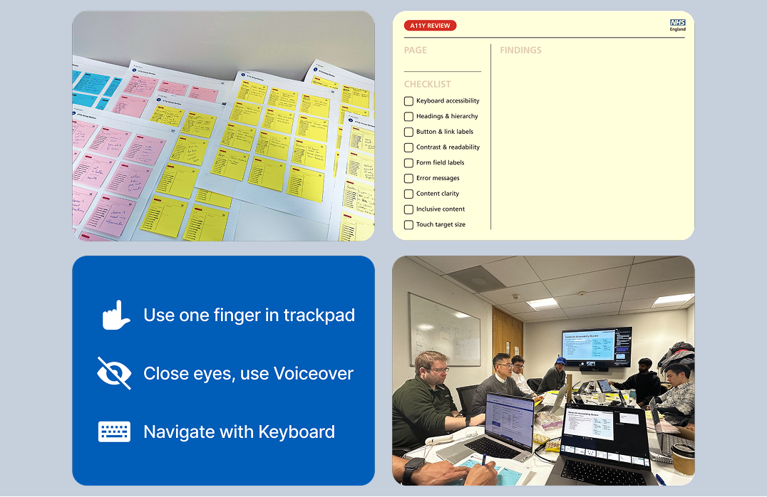
Accessibility was not treated as a final QA checklist. I helped the team build shared understanding through guidance, tool usage, and workshop activity. The team explored the product from different perspectives: keyboard navigation, VoiceOver, one-finger trackpad use, zoom, and reduced visual context.

Redesigning structural accessibility barriers

Interaction redesign, not surface-level patches

The work

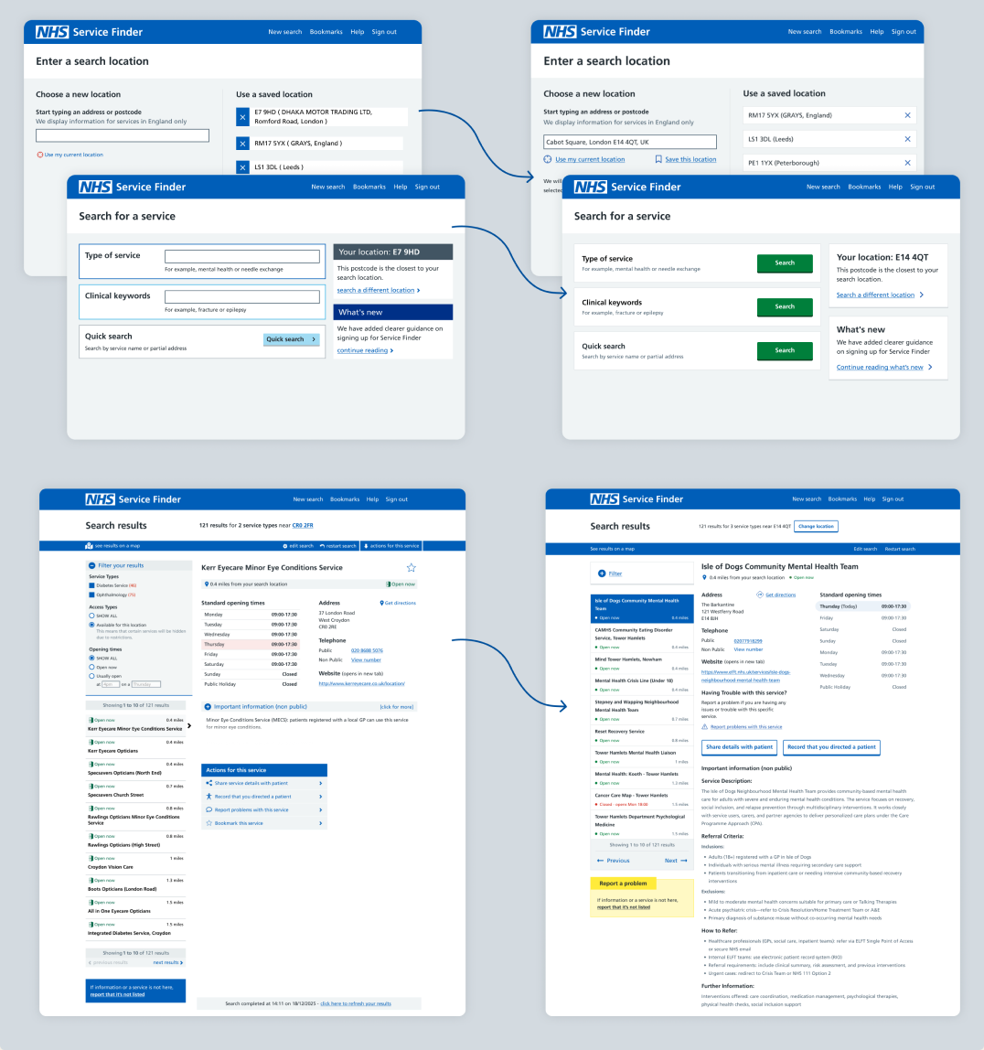
Some findings could not be solved through small UI tweaks. Structural issues included search behaviour that moved users unexpectedly, missing or unclear submit actions, incorrect focus order, unclear link purpose, low-contrast or undersized actions, dense result pages, and repeated patterns that made keyboard and screen reader navigation harder. I redesigned these areas so actions were visible, page changes were predictable, and key information was easier to understand.

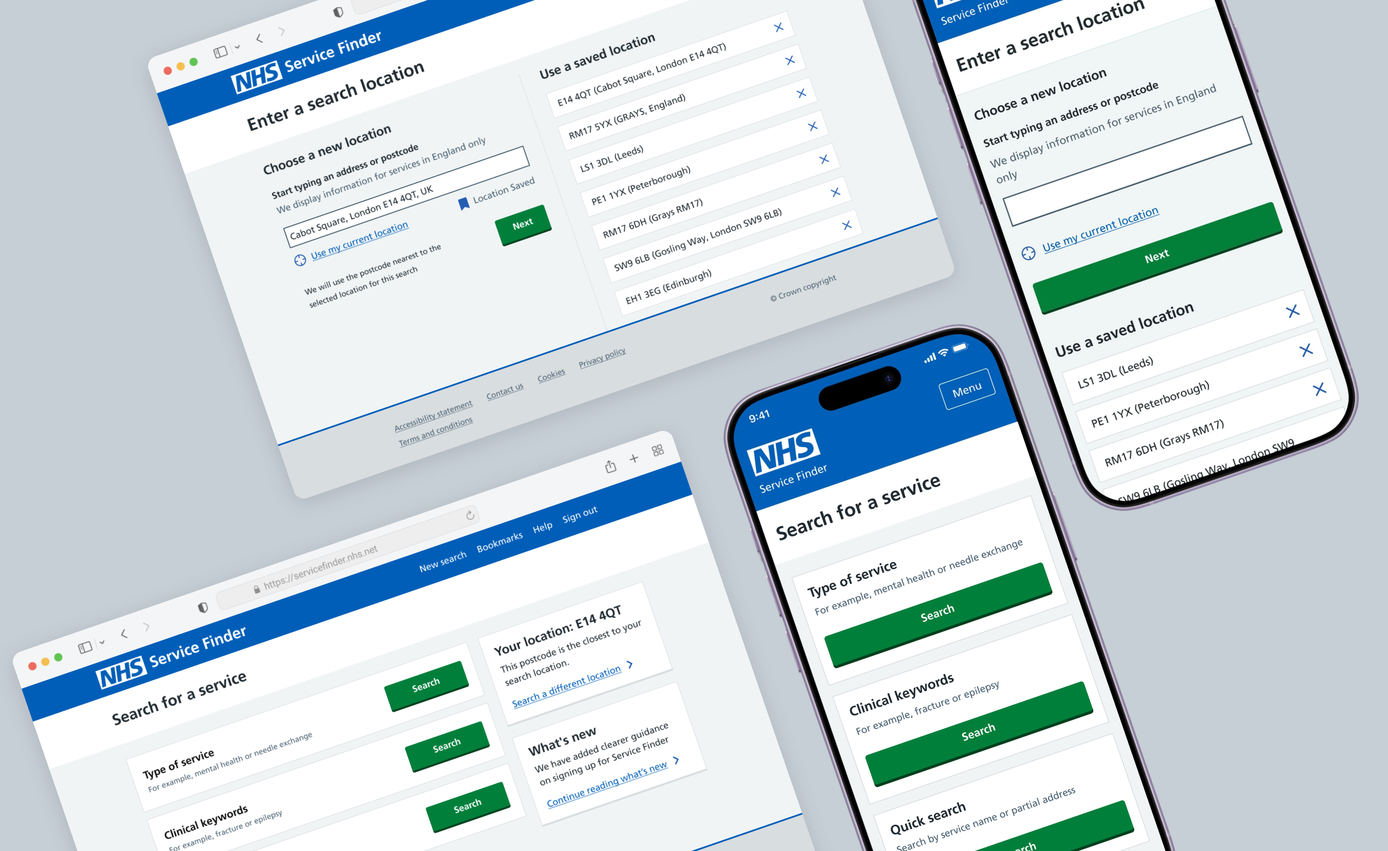
Before and after of the NHS Service Finder search location and search for a service screens, showing redesigned actions, labels, and hierarchy

Validation

Testing and accessibility labs

The outcome

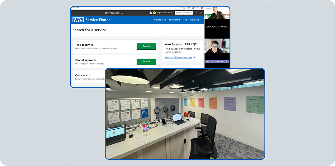
Improvements were validated through usability testing and accessibility testing, including accessibility lab sessions. Internal task-based testing showed a 35% improvement in completion speed for users with accessibility needs after the redesign.

03

Chapter

NHS Design System alignment

From local component debt to system-level alignment

Design System as a sustainable accessibility strategy

The tradeoff

The accessibility work exposed a deeper issue: many barriers were tied to repeated local components that had drifted from NHS Design System standards. Developers proposed patching local components for speed. I understood the short-term logic — but patching would preserve the long-term problem: maintaining components that imitated NHS patterns and reworking them whenever accessibility or design system standards changed.

The better long-term approach was to move repeated patterns toward NHS Design System components where possible, adapt minor differences, and design Service Finder-specific patterns only where standard NHS components did not fit the use case.

Type Example Decision
Match Button, input, checkbox Use NHS Design System directly
Minor change Form error, filter panel, banner Align content, spacing, focus, labels
Does not match Search result card, auth recovery state, ODS journey Create Service Finder-specific pattern

Service Finder-specific components

Where NHS patterns didn't fit

The approach

Not every Service Finder pattern had a direct NHS Design System equivalent. For dense service result cards, quick search, symptom or clinical keyword search, opening times tables, open/closed status tags, authentication recovery states, and ODS information flows — I documented the use case, accessibility needs, interaction behaviour, and relationship to existing NHS patterns before deciding whether to keep the pattern local or discuss it with the NHS Design System team.

04

Chapter

Accessible service search and interaction craft

Dense service information, fast decisions

Making search results easier to scan

The problem

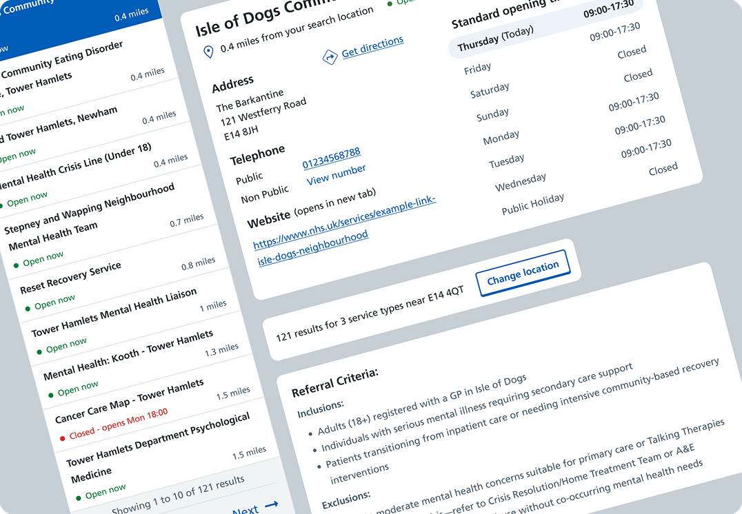
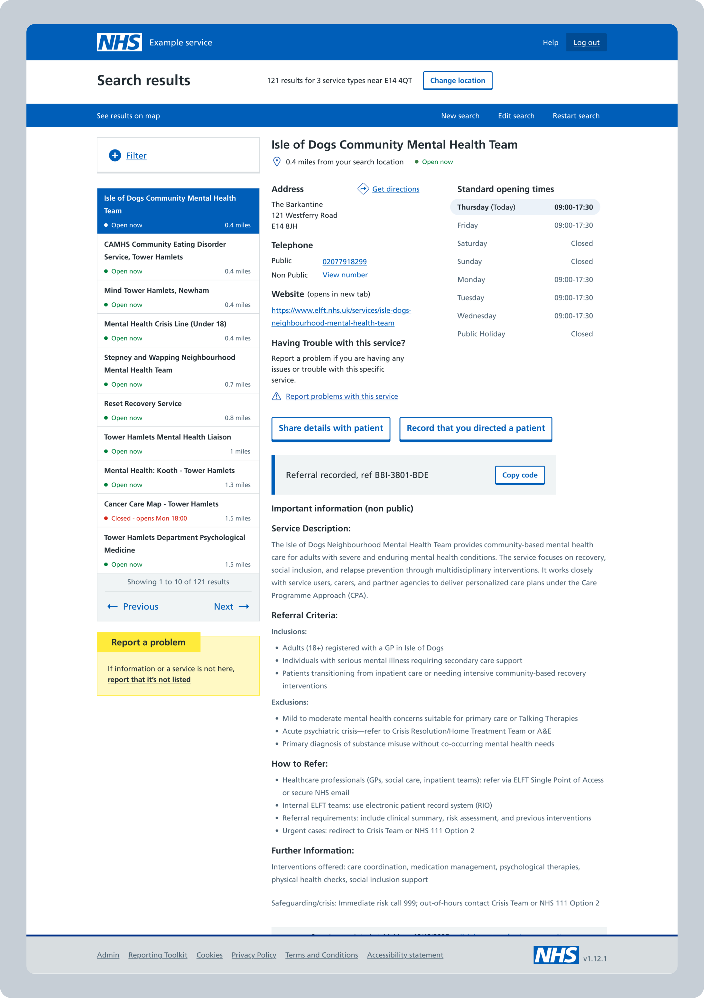
Each search result carried dense service information: service name, type, distance, opening status, referral route, eligibility, access instructions, contact details, and notes. The problem was not displaying this information — it was helping users compare services quickly and confidently.

I grouped service information into three priority levels: Primary (service name, type, opening status, distance), Secondary (referral route, eligibility, access criteria), and Supporting (access notes, contact details, additional information).

Supporting different search behaviours

Consistent patterns across intent and device

The need

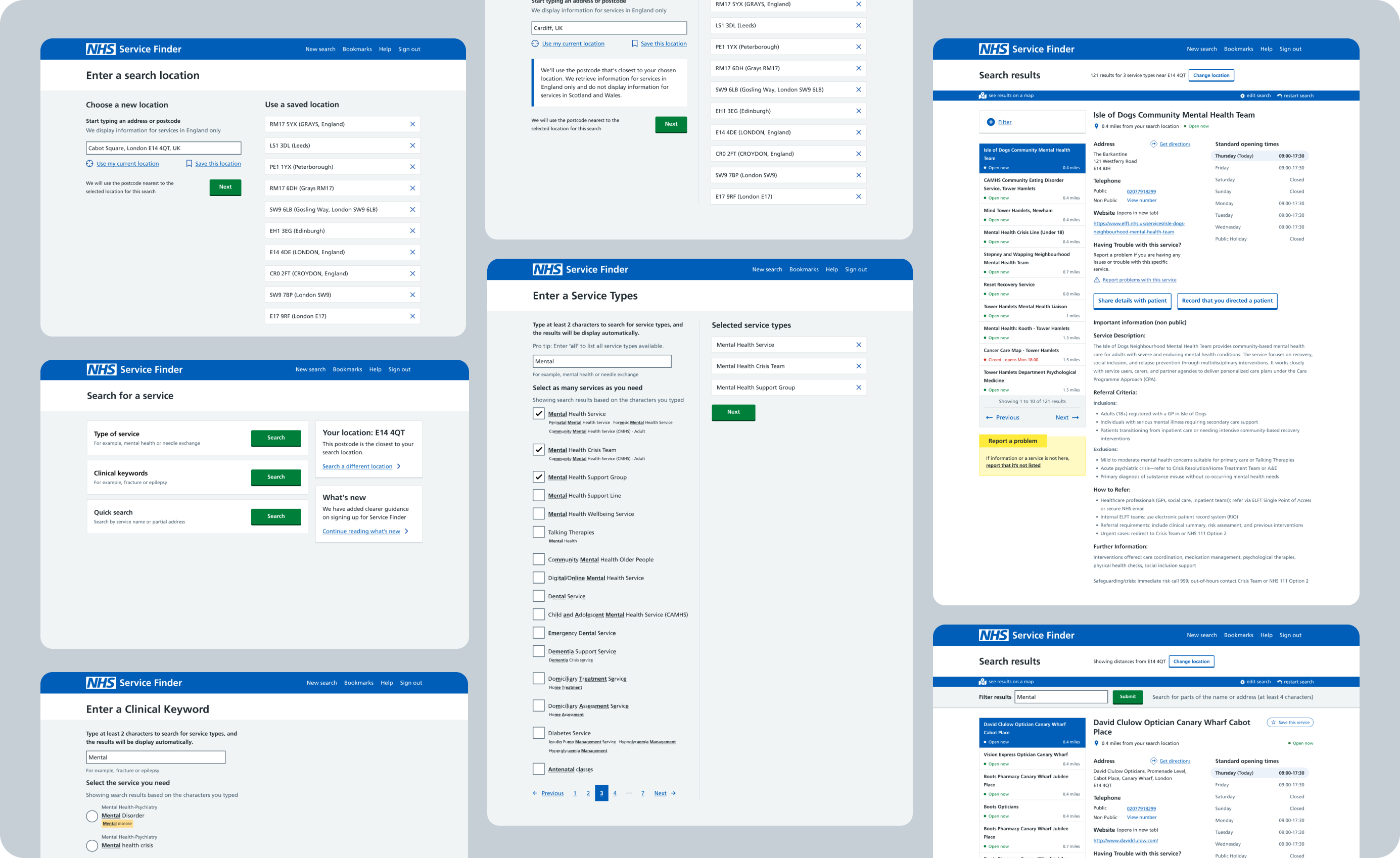
Service Finder supported different ways to search: service search, clinical keyword or symptom search, and quick search. These needed consistent patterns while supporting different user intents. I aligned search behaviours across desktop and mobile, making sure users could understand where they were, what they were searching for, and how to recover when results were not useful.

“Search patterns were aligned across different intents and screen sizes while preserving clear hierarchy and recovery guidance.”

Accessibility beyond components

Accessible journeys, not just accessible components

The focus

Accessible components were not enough. A button can be accessible in isolation, but the journey can still fail if the page structure is confusing, keyboard order is wrong, error content is unclear, or users cannot recover from no-results states. Accessibility had to work at the level of structure, content, hierarchy, interaction states, and recovery paths.

Areas addressed

  1. 1 Heading structure — logical hierarchy for screen reader navigation across all pages.
  2. 2 Keyboard focus order — follows visual reading order through each result and page.
  3. 3 Visible focus states — 3px solid ring, visible in light and forced-colour modes, WCAG 2.2.
  4. 4 Form labels and errors — persistent labels, errors above the field, linked via aria-describedby.
  5. 5 No-results recovery — actionable next steps instead of dead ends.
  6. 6 Contrast and readability — 4.5:1 for text, 3:1 for UI components across all screens.
  7. 7 Authentication error recovery — h1, plain language explanation, and role="alert" for screen readers.

Selected final UI

Final screens

Selected final screens from the secure access migration and accessibility-led redesign.

Outcomes

What the work achieved

  • Secure access improved without compromising continuity

    The wider user base moved toward MFA-backed Care Identity access. Ambulance trust users had a controlled temporary exception during winter pressure, with a time-bound sunset on 31 March 2026.

  • 94% completed migration without contacting support

    Users moved through staged in-product messaging: awareness, preparation, deadline warnings, interrupt pages, decommissioning, and emergency-user sunset. In the first week, 94% completed migration without support.

  • Onboarding moved from days to near real time

    Manual verification previously took an average of 2.4 days. By using Care Identity-backed organisation and role data, eligible users could access Service Finder in near real time, while unclear cases were routed to approval, support, or recovery instead of becoming dead ends.

  • Accessibility improved across critical journeys

    36 key pages audited; 25 had issues. Structural barriers were redesigned across login, onboarding, search, and recovery journeys. Internal testing showed a 35% improvement in completion speed for users with accessibility needs.

  • Interface became more consistent and maintainable

    Moving repeated patterns toward the NHS Design System reduced inconsistency, accessibility risk, and repeated local rework. The audit clarified where NHS components could be used directly and where Service Finder-specific patterns were justified.

  • Search results became easier to scan

    The redesigned result structure helped users compare service type, availability, distance, referral route, and eligibility more efficiently. The tiered hierarchy made results more predictable for screen reader users and faster for sighted users.

Reflection

“Security and accessibility both depend on trust.”

A secure login only works if users understand what is happening, know what to do next, and can recover when something fails. An accessible component only matters if the whole journey is accessible: structure, content, hierarchy, keyboard order, interaction states, and recovery paths all have to work together.

This work also showed me that cross-platform journeys need more guidance than journeys contained inside one product. When users leave one service for another, the interface has to explain where they are going, why, whether they will return automatically, and what to do if they do not.

If I were doing this again, I would bring accessibility, content design, and design system discussions together even earlier. Accessibility should not be treated as final QA or a list of fixes. It should shape the journey, the design system, and the way teams make product decisions.

For Service Finder, good UX meant making a complex security migration feel clear, safe, and recoverable — while building a more accessible and maintainable foundation for the service.