
BPme App – Pay for Fuel feature
Overview:
BPme, a mobile app for BP customers, enables users to pay for fuel without going inside a store to pay or leaving their vehicle. This project focused on enhancing the user experience by introducing a Pay for Fuel feature for the German, UK, Australian, Polish, and Spanish markets. The goal was to simplify the payment process, integrate loyalty programs, and improve transaction visibility.
My Roles:
User Journey Mapping
Benchmarking Wireframe Visual Designs Prototyping Collaboration with Devs
Duration:
8 Months
Deliverables:
High-fidelity designs accompanied by an interactive prototype were delivered, tailored for both English and German-speaking audiences to ensure localization. The designs encapsulated BP’s brand identity and functionality, ready for testing and deployment.
Problem Statement:
Research Approach
Surveys and usability tests across different regions revealed common user frustrations with the Pay for Fuel feature. These methods helped identify pain points related to payment processes, loyalty program integration, and transaction visibility. Key findings included:
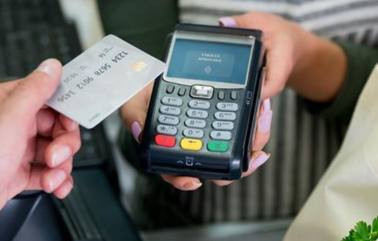
- Inconvenient Payment Process: Most users disliked having to leave their cars to pay for fuel, which disrupted their convenience.
- Loyalty Program Confusion: Users faced challenges with tracking and redeeming points, as different countries had varied loyalty systems.
- Lack of Digital Receipts: Users expressed a strong desire for easier access to transaction histories through the app, as they struggled to track their payments without digital receipts.
These insights were crucial in refining the user journey, ensuring the design addressed these issues while enhancing the overall user experience across various markets.
Benchmarking:
As part of the design process, comprehensive benchmarking was conducted to evaluate similar loyalty programs, mobile payment systems, and shopping experiences across various industries. This involved analyzing how leading brands handle user interaction, reward integration, and payment flows. Key insights were drawn from best practices in digital wallets, seamless mobile payment solutions, and loyalty program designs. The research informed key design decisions that prioritized user convenience, security, and consistency across multiple markets..
Key Solutions:
Solution1: Digital wallet integration
User Problem: Users had to leave their cars to complete payments inside the store.
Opportunity: Create an effortless payment process that makes paying faster and more convenient.
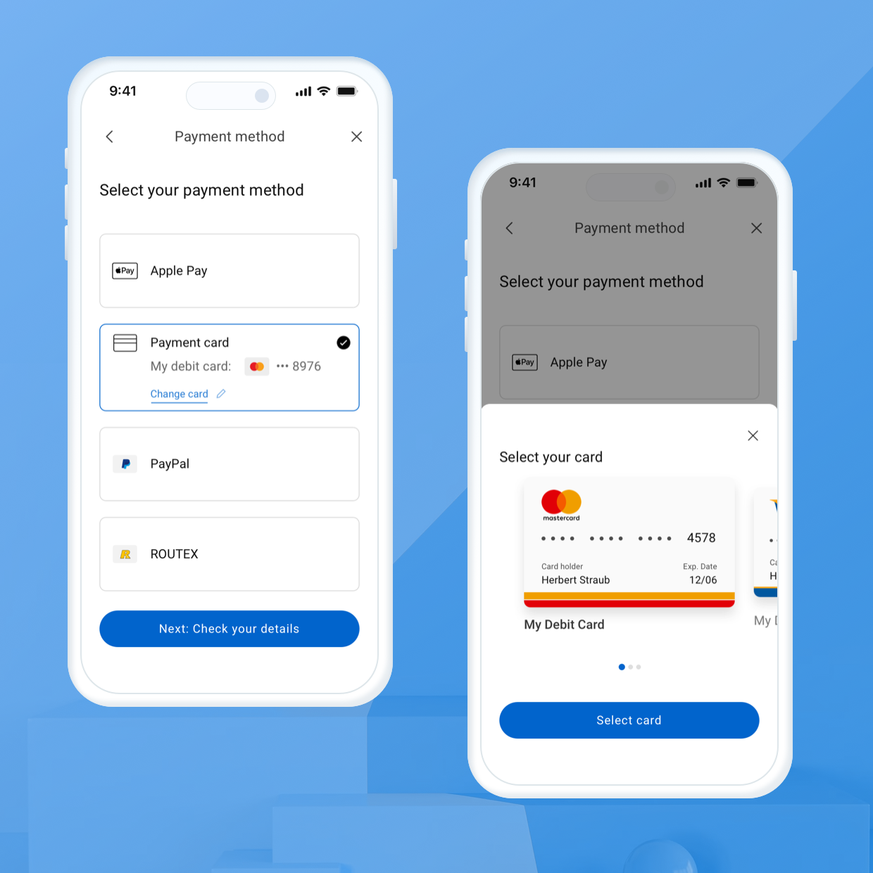
Solution: We integrated a digital wallet within the BPme app that allows users to pay via multiple options—Apple Pay, Google Pay, PayPal, and loyalty cards. This enables quick, in-app payments from the comfort of the vehicle.
Solution 2: Integrated Loyalty Program
User Problem: Difficulty earning or redeeming loyalty points across regions.
Opportunity: Provide seamless access to loyalty program features across different markets.
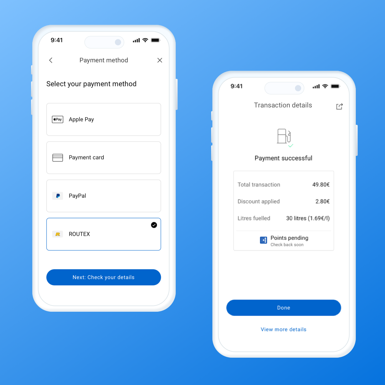
Solution: We embedded loyalty point functionality, enabling users to automatically earn and redeem points no matter where they refueled. This reduced the complexity of managing regional reward programs and gave users direct access to their points in-app.
Solution 3: Real-Time Transaction Updates & Digital Receipts
User Problem: Users struggled to track and access their transaction history due to the absence of digital receipts.
Opportunity: Improve transaction visibility and accessibility.
Solution: We introduced real-time transaction updates, allowing users to view their fuel purchase history immediately. Additionally, digital receipts were made available for easy reference, giving users peace of mind and reducing dependency on physical receipts.
Final Solution:
Users could effortlessly select their station, pump, and fuel amount, then complete payments using digital wallets like Payment cards, Apple Pay, Google Pay, or loyalty points. The app streamlined the process further by integrating real-time transaction updates, digital receipts, and a cross-regional loyalty system, allowing users to earn and redeem points seamlessly.
Design & Prototype
UX Design:
The role of UX in this project was to ensure that the user experience for BPme’s Pay for Fuel (PFF) feature was intuitive, convenient, and seamless, with a strong focus on simplifying the payment process and integrating loyalty systems.
User journey mapping
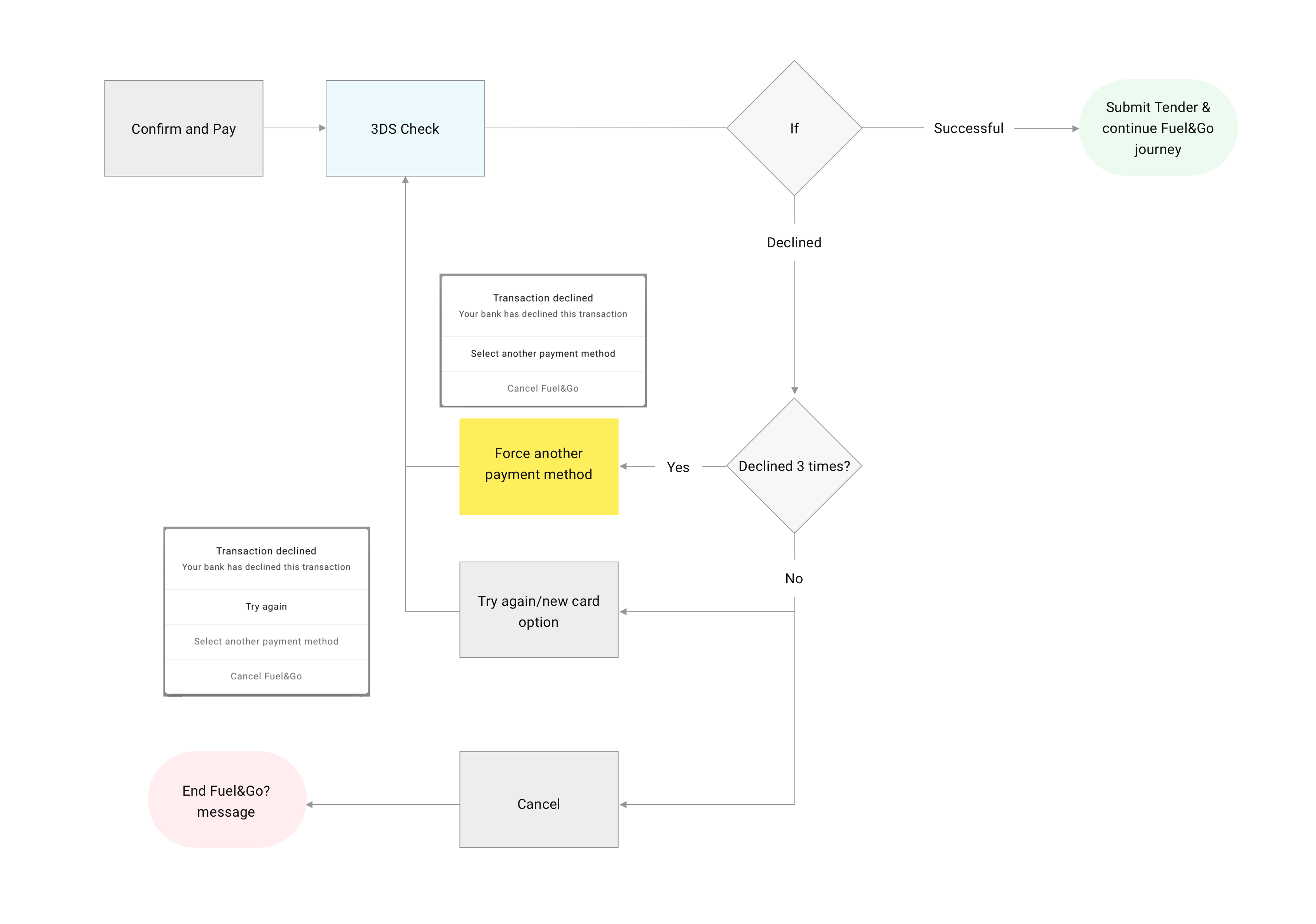
I started with journey mapping. But instead of a typical top-level overview, I including our team decided to break the experience down in a much more granular way. We split the entire fuelling journey into several smaller stages. Every step was mapped visually in a detailed flowchart to help us spot possible friction points, “unhappy paths,” waiting states, and edge cases. Throughout this phase, I stayed in close contact with our engineering and product teams to make sure what I was designing aligned with them.
Below is an example of flow chat that shows happy and unhappy path of making the payment for fuel with card:
Wireframing & Collaboration
Once the journey was fully mapped, I started creating wireframes for each part of the flow. Given we were working in an agile setup, this helped us move quickly. The wireframes themselves became an invaluable communication tool — not just for the design team, but for the wider stakeholders too. It gave the teams a clear sense of how the feature would come to life.
We then ran user testing sessions using these wireframes, gathering feedback early and often. Many of our iterations came directly from those sessions. For example, we improved the pump selection experience based on real user confusion.
Here are some parts of the wireframe:
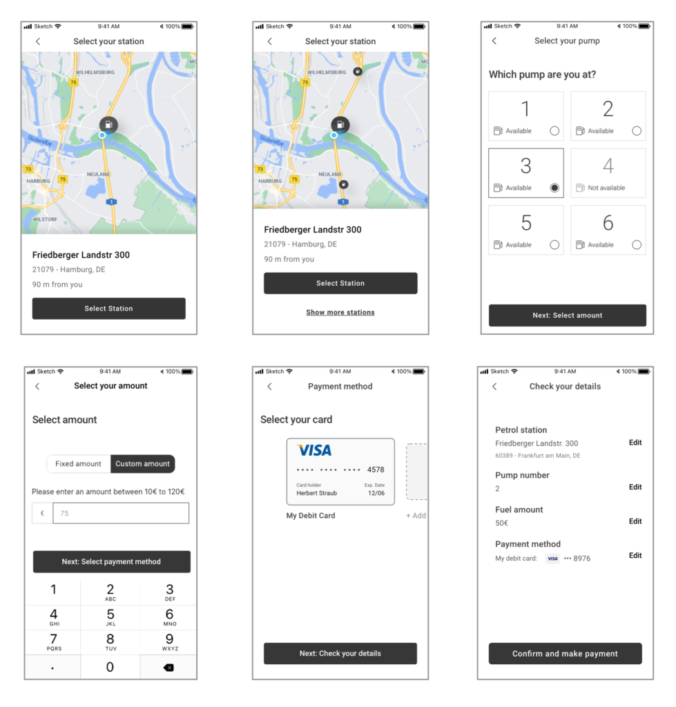
UI Design:
Since we were approaching the design step-by-step, I started by focusing on the very first interaction — where users begin their Pay for Fuel journey. The first screen involved selecting the Pay for Fuel option and choosing a nearby station. I followed BP’s official design system to ensure visual consistency with the rest of the BPme app and brand guidelines.
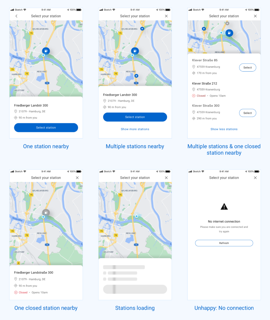
To explore different possibilities, I created several design variations for the station selection screen. I paid close attention to various states of the interface — like when no station is available, when GPS is turned off, or when stations are loading. Prototyping these flows helped us visualise the interaction and allowed stakeholders to understand how the feature would work in real usage.
Image below shows different states of same page including, happy and unhappy paths:
Micro animation demonstrating how the interaction would be when user navigate the screen.
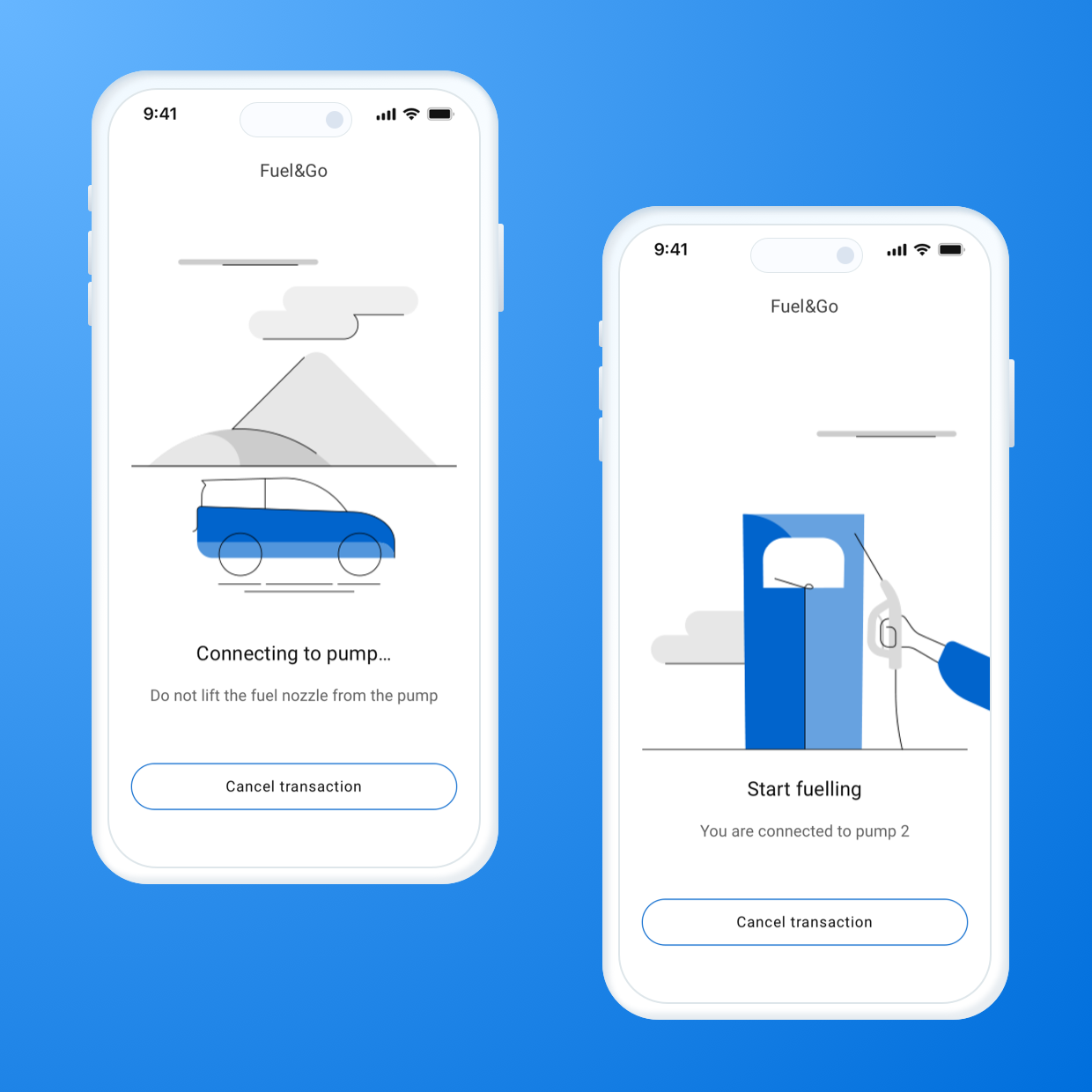
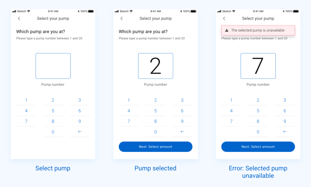
Once the team felt confident with that screen, I moved on to the pump selection step. As with the previous screen, I explored a few layout options to make the experience intuitive and quick. The goal was to reduce any friction users might face while trying to select the correct pump.
Below are example of few states of select pump screen:
Next came the Select Amount screen, which turned out to be one of the most sensitive steps in the journey. Here, users needed to choose how much fuel they wanted to purchase. I broke the screen down into different possible scenarios — like preset amounts, custom amounts, and error states — and designed each one with clear visual guidance. I had to think various scenarios like, how the interaction will be when user initially selected a fixed amount, after that change their mind to select a custom amount and many others. I have created solutions for all those scenarios.
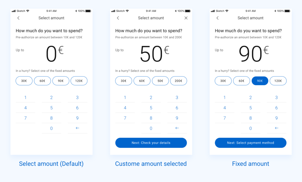
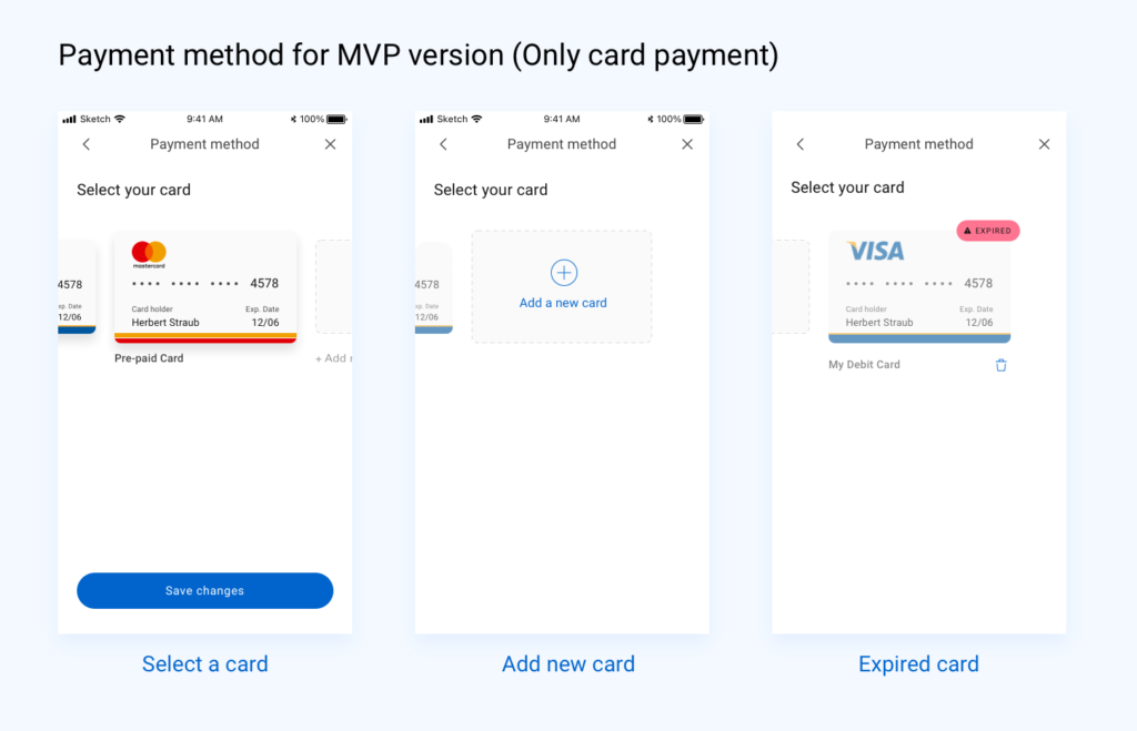
The Payment step was slightly different depending on the version. For the initial MVP, we supported only card payments. But in the post-MVP version, I extended the UI to include Apple Pay, Google Pay, PayPal, and loyalty point options. This added flexibility while keeping the interface clean and easy to understand.
I continued this approach for the remaining screens: Review, Transaction Summary, and Transaction Details. Each design was built to ensure clarity, visual consistency, and smooth handoff to the development team.
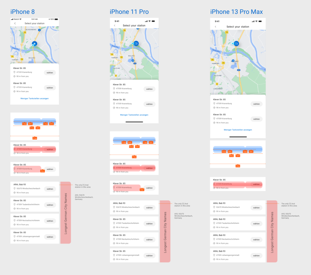
Throughout the process, I prioritised usability, accessibility, and performance. I made sure the designs were responsive across a range of screen sizes — from iPhone SE (or 8) to iPhone 13 Pro Max, which was the latest at the time. I created detailed annotations and provided guidance to the engineering team, making the development handover smoother.
Additionally, I documented implementation suggestions for regional teams — including localisation guidance for Germany (like space for translated strings) and layout adaptations for Australia, where UI expectations and user habits differed slightly. These recommendations helped ensure consistency across markets while respecting local needs.
User Testing and Iteration
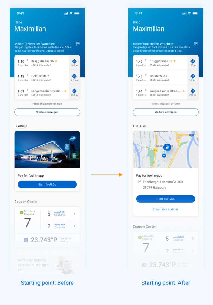
As part of our iterative design process, we tested the prototype with real users early on. One key area we focused on was how users began their Pay for Fuel journey from the home screen. Initially, we introduced a “Start Fuel&Go” card on the homepage — a UI element that users would tap to initiate the process. Tapping it would then lead them to the next step: selecting a nearby fuel station.
However, during testing, a recurring piece of feedback surfaced: the extra tap on the “Start Fuel&Go” card felt unnecessary. Users expected to see station options right away rather than first entering a separate flow. That single click added subtle friction and made the experience feel slower than it needed to be.
So, we iterated.
Instead of treating the card as a static entry point, we redesigned it to be dynamic — showing the nearest available stations right on the homepage in the UI card. This allowed users to select a station immediately, making the app feel more responsive and efficient. Once a station was selected, the app would then transition into a full-screen view where users could continue with selecting a pump, setting the fuel amount, and completing the transaction.
Results:
The Pay for Fuel experience was highly appreciated by the client team for its simplicity, clarity, and adaptability. Our human-centred design approach and attention to detail helped create a consistent, scalable solution that worked across diverse markets and user needs.
The product was first adopted by the Australian and German teams, who implemented the journey using the localisation guidelines and visual framework we provided. Its success in those markets led to further adoption in Poland and Spain — showcasing the flexibility of the design system and the value of building with global scalability in mind.
This wide adoption reflected not only a strong collaboration between design, product, and engineering, but also the impact of designing with both user needs and market realities at the core.
What’s Next?
Following the success of the Pay for Fuel experience, the solution received positive feedback from the client team and was soon adopted by BP’s Australia and Germany markets. Later, it was also rolled out in Poland and Spain — a strong signal of its value across diverse regions.
This high-quality work not only helped improve the user journey for millions of BP customers, but also strengthened the relationship between BP and our team. As a result, our company secured additional projects with BP, and I was soon assigned to another key initiative within their digital ecosystem