Mobile / Energy
BPme App: Designing Pay for Fuel and Click & Collect for a multi-market retail platform
Overview
BPme began as a loyalty and station-finding app. But customers still felt that station visits took too much time: paying for fuel meant going inside the store, buying food or coffee meant searching in-store and waiting for preparation, and managing payments, rewards, discounts, and receipts felt complicated.
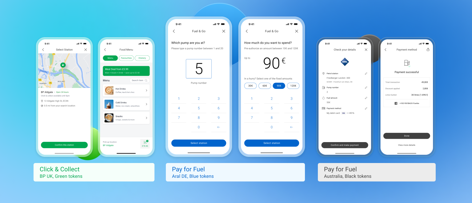
I led product design for two of BPme’s most important customer-facing initiatives: Pay for Fuel and Click & Collect, helping customers pay for fuel from inside the car, order food or coffee ahead of time, and make overall station visits faster across multiple regions.
This case study follows how I worked on Pay for Fuel first, then used that foundation to shape Click & Collect, with a shared design model that could scale across BP and Aral markets.
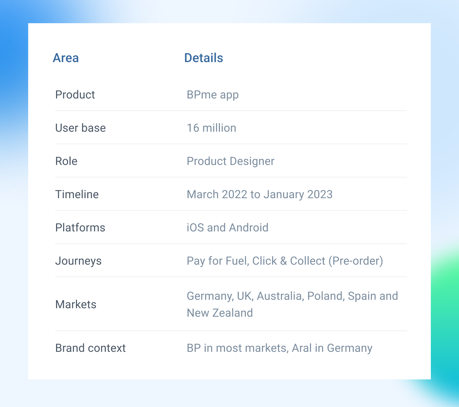
Project snapshot
I worked as a Product Designer, focused on translating research and business constraints into a scalable app experience.
For BPme, the challenge was not only to make this journey faster. It was to make it feel clear, safe, and repeatable across markets with different brands, reward systems, payment options, and engineering teams.
Business Context
Designing for global scale
By 2022, BPme operated across multiple regions and had reached 16 million active loyalty users worldwide. The app was already an important digital touchpoint for BP customers, supporting loyalty, rewards, station discovery, and transaction history across different markets.
Each region had its own product and engineering team, with different brand requirements, payment expectations, loyalty models, language needs, and local market rules. Germany operated under the Aral brand, while markets such as the UK and Australia used the BP brand and their own local app structures.
This local ownership helped each market shape the app around its customers, but it also created duplication. If every region designed and built station-service journeys separately, the experience could become inconsistent, slower to deliver, and harder to maintain.
BP needed a more efficient way to introduce new station-service journeys across this ecosystem. Pay for Fuel and Click & Collect had to feel like part of the same BPme environment, while still giving local teams enough room to adapt the experience for their brand, language, payment options, loyalty model, and market rules.
User Needs
What are the real problems users were facing
A fuel station visit is usually meant to be a quick stop, but the existing experience often turned it into a series of small, frustrating tasks.
For fuel, customers had to leave their car at the pump, walk inside, queue at the main counter just to pay, and return to the vehicle.
For food or coffee, they had to search the store, wait for their items to be prepared, and often queue a second time to complete the transaction or collect.
After the visit, customers, especially business and fleet drivers, could struggle to find digital receipts for expenses, check if regional discounts were applied, or confirm their loyalty rewards.
These small interruptions made routine station stops feel slower and more difficult, especially during morning commutes, work breaks, or short errands.
What this meant for BPme
How might BPme make everyday station visits faster, while giving customers a clearer way to pay, collect, use loyalty, and access receipts?
For Pay for Fuel, this meant letting customers activate the pump and pay from their vehicle, without walking into the store or queuing at the counter.
For Click & Collect, this meant helping customers reduce waiting time by browsing the menu and ordering food or coffee before they arrived at the store.
For BP, the bigger challenge was scale. These experiences needed to work across different regions, brands, and station formats, so each market could adopt the same core journey without designing and building its own version from scratch.
My Role
Designing Pay for Fuel first, then extending the foundation into Click & Collect
I worked as the Product Designer on BPme from March 2022 to January 2023, across iOS and Android.
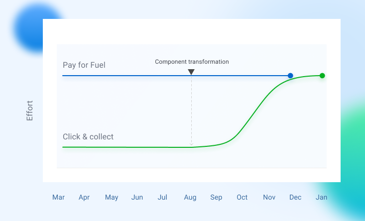
The work started with Pay for Fuel, because it was the first journey moving into detailed design and delivery. I led the design from early journey mapping and wireframes through to high-fidelity UI, prototyping, localisation, and engineering handoff.
Click & Collect was also part of the process from the early stages, but at first it was a lighter exploration stream. During the first few months, most of my time was focused on Pay for Fuel, while around 20% of my time went into understanding the Click & Collect opportunity, reviewing early flows, and identifying where it could share patterns with Pay for Fuel.
As the Pay for Fuel patterns matured, I moved deeper into Click & Collect and used that foundation to shape the order-ahead journey. This meant carrying forward shared parts of the experience, such as station selection, payment, loyalty, receipts, transaction status, and recovery states, while adapting the rules for ordering food or coffee ahead of arrival.
I worked closely with the researcher, who led the service design and research activities. My role was to support synthesis, benchmark mobile payment and ordering patterns, and translate the findings into product flows that could work across multiple markets.
I also worked closely with three product managers across Germany, the UK, and Australia, along with engineers, regional teams, and BP design leadership. Together, we reviewed decisions, worked through market-specific requirements, and made sure the experience could scale across BP and Aral markets.
Challenges
The business and system challenge
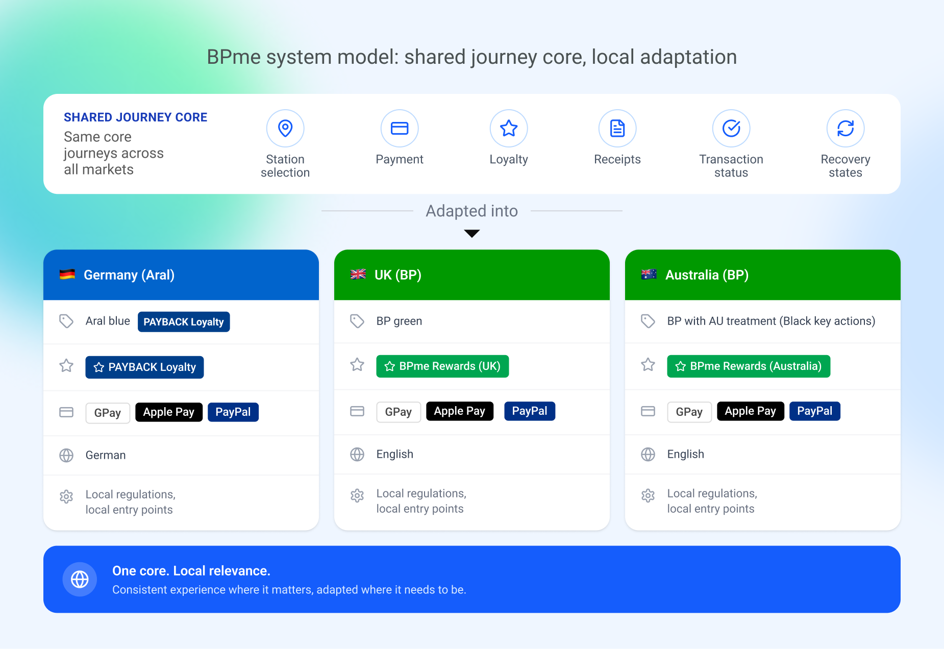
BPme operated across multiple regions, where the same core journeys had to support different brands, loyalty models, payment expectations, language needs, and market rules.
In Germany, the product needed to support Aral branding and Payback loyalty. In the UK and Australia, the experience followed the BP design foundation, but visual treatment still differed by market, such as green accents in the UK and black accents for key actions in Australia, alongside local language, payment, and loyalty requirements.
That meant core patterns such as station selection, payment, loyalty state, receipts, transaction status, and recovery states could not be treated as one fixed design that was simply translated or reskinned for each region.
The challenge was to define what stayed consistent at the product level, and what regional teams needed to adapt for their market.
If the design was too fixed, some markets would struggle to support their local brand, payment, loyalty, or regulatory needs. If it was too flexible, the experience could split into separate versions that were harder to design, build, govern, and maintain.
Design Sequence
Solving the highest-risk customer journey first
Pay for Fuel was the first journey to move into detailed design and delivery. It also tested the shared product foundations under the strictest real-world conditions, because the journey connected the app to a live forecourt transaction.
The customer had to be at the right station, choose the correct pump, authorise payment, wait for the pump to activate, refuel, and trust that the transaction had completed correctly.
That meant the design had to handle the core patterns early: station selection, proximity checks, pump selection, payment, loyalty, receipts, transaction status, and recovery states.
Designing Pay for Fuel first helped me define which parts of the experience needed to stay consistent, and which parts needed to adapt by market or journey.
That thinking later shaped Click & Collect. Some patterns could be reused, but the rules changed. Pay for Fuel required the customer to be near the station because it connected to a live pump transaction. Click & Collect needed to support ordering ahead, before the customer arrived.
Phase 1
Pay for Fuel - Friends and Family version
Proving the core transaction loop
The first release was the Friends & Family version. Its purpose was to validate the core Pay for Fuel journey before introducing more payment methods, loyalty options, and market-specific complexity.
This version supported card payment only, which kept the first release focused on the core transaction: selecting an eligible station, choosing the right pump, setting a pre-authorisation amount, authorising payment, waiting for pump unlock, fuelling, and receiving confirmation.
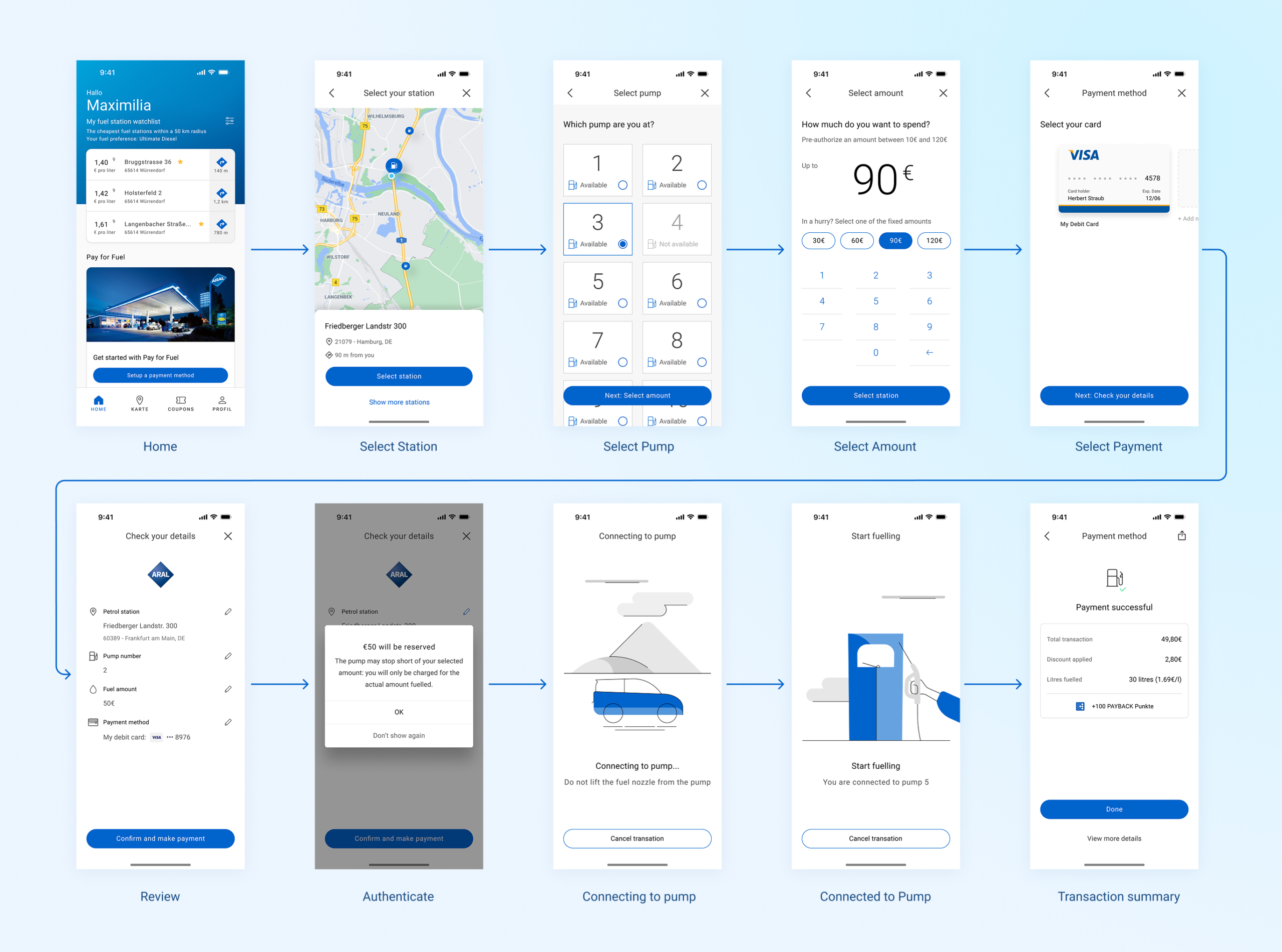
The station step was the first point where the journey had to connect the customer’s physical context with service availability. I designed variations for different station-selection states, including one nearby eligible station, multiple nearby stations, closed stations, loading, no connection, and cases where the customer was outside the allowed distance.
This made the screen more than a simple location picker. It had to help customers understand whether Pay for Fuel was available, which station they were selecting, how far away it was, and whether they could continue.
These states later became useful for Click & Collect as well, where station selection also depended on service availability, such as whether ordering was supported at that store.
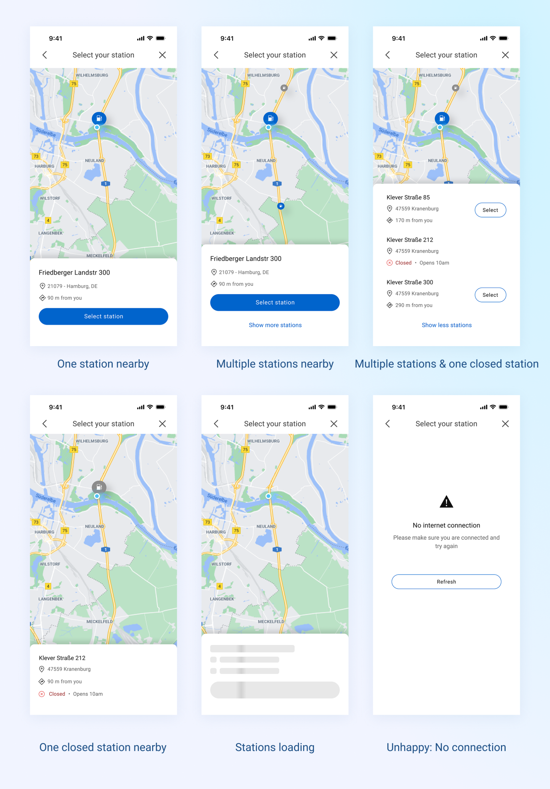
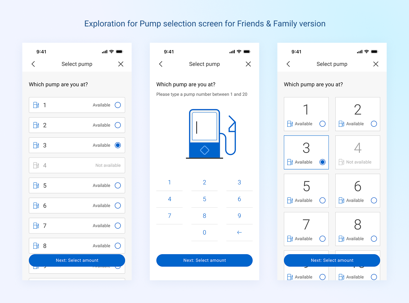
Pump selection was one of the most sensitive moments in the Pay for Fuel journey. If a customer selected the wrong pump, they might not be able to start fuelling and may need staff help to fix the issue. The screen needed to work quickly in a real forecourt environment, including poor light, glare, rain, pressure from other cars, and small screens.
In the early design, I explored pump selection through a simple list, larger numbered list items, and tile-based number layouts. The goal was to make pump numbers easy to scan and large enough to tap safely on a small screen. This gave the Friends & Family version a clear starting point, while leaving room to validate whether the interaction created enough confidence before payment.
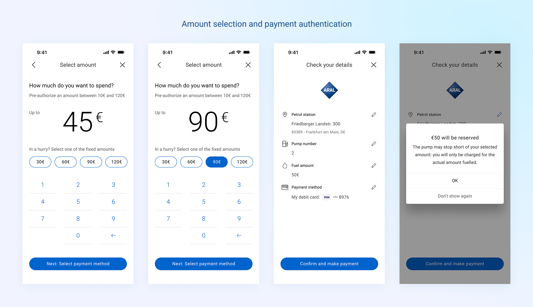
The amount step introduced another trust moment. Customers needed to understand that the selected amount was a pre-authorisation, and that they would only be charged for the fuel they actually dispensed. I kept this step focused by separating amount selection from payment review, using fixed amount options, allowing custom entry, and confirming the reserved amount before authorisation.
Alongside the happy path, I also mapped and designed the key failure states across the journey, including payment failure, pump activation issues, connection loss, wrong pump selection, and delayed confirmation. Customers needed to understand what had happened, whether they had been charged, and what to do next.
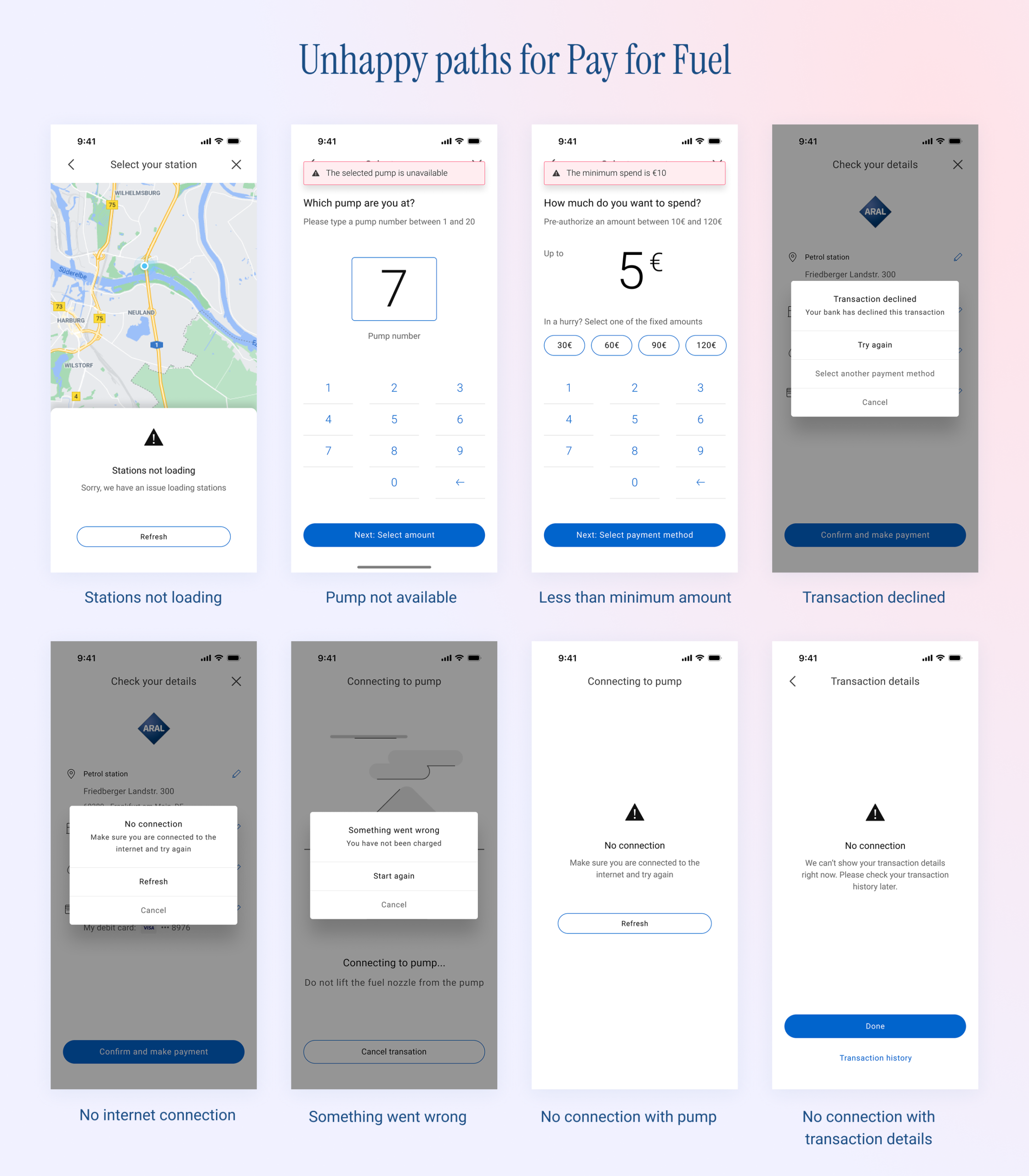
This phase gave the team a working version of the core Pay for Fuel transaction. It also established patterns for station eligibility, pump selection, payment, transaction status, receipts, and recovery states. These patterns later supported the Production version and helped clarify parts of the Click & Collect flow, especially around store availability, payment, receipts, and order status.
Phase 2
What testing changed
Responding to context earlier in the journey
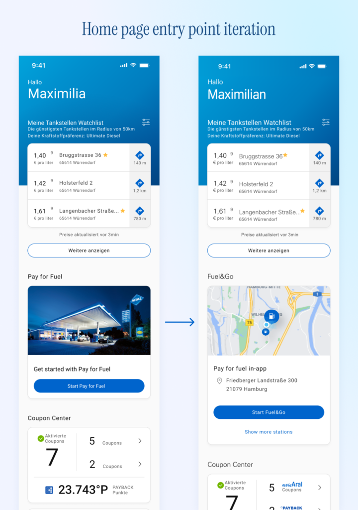
Testing the Friends & Family version showed that the German Start Fuel&Go card made users tap before they could see whether Pay for Fuel was available nearby.
People opening the Aral app at or near a station had usually already decided to refuel, but they still needed to know whether a nearby eligible station was available, open, and close enough to use. In the early flow, that information only appeared after they entered the Pay for Fuel flow.
I changed the card into a dynamic station-selection module. Nearby eligible stations appeared directly on the home feed, with availability shown earlier in the journey. This allowed users to understand whether they could continue before entering the full Pay for Fuel flow.
This removed an unnecessary tap and made the app respond to the user’s physical context sooner.
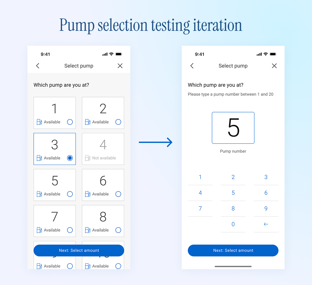
Testing also showed that pump selection needed a stronger decision moment. The early tile-based layout made pump numbers visible, but users sometimes had to scroll to find the correct pump. That added effort at a moment when they were already sitting at the forecourt and trying to move quickly.
There was also a risk in how fast the interaction felt. Because selecting a pump was a simple tap, users could choose a pump without clearly pausing to check whether it matched the pump next to their vehicle. For a low-risk screen, that might be acceptable. For Pay for Fuel, the pump choice affected a live physical transaction.
I adjusted the pump selection pattern to make the selected pump more prominent, reduce unnecessary scanning, and create a clearer confirmation point before users continued to payment.
The goal was to make the correct choice easier and the wrong choice less likely.
This phase helped refine the difference between speed and confidence. The journey still needed to be fast, but the most sensitive steps also needed to slow users down just enough to confirm the right decision.
Phase 3
Production version of Pay for Fuel
Expanding the payment, loyalty, and localisation model
After the core journey was validated, the Production version expanded the payment and loyalty model.
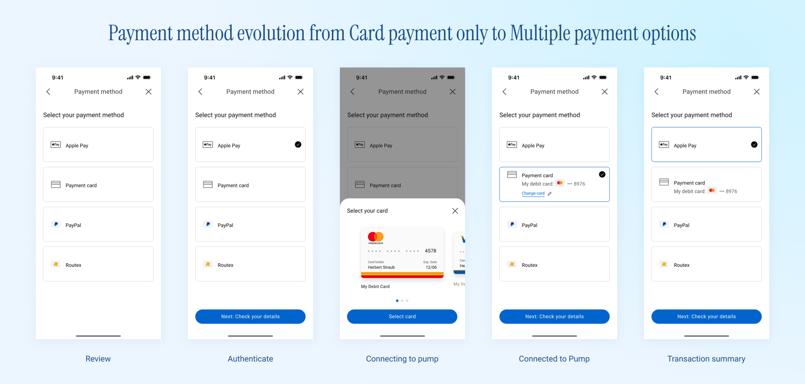
The Friends & Family version only needed saved card selection. Production needed to support a wider payment ecosystem, including payment cards, Apple Pay, Google Pay, PayPal, loyalty redemption, Payback in Germany for Aral customers, and Routex-related BP and Aral use cases.
The payment step needed to grow without becoming a different journey for every region. I designed the payment step so payment methods could be added, removed, or reordered as modular options, without changing the surrounding screens or the core flow.
This avoided a common problem in multi-market products: a new local payment or reward option should not force the whole payment journey to be redesigned.
Receipts and transaction history
Receipts were part of the same trust layer. Customers needed to see what they paid, what was fuelled, which discounts or points were applied, and where the transaction happened.
Beyond showing transaction history in the app, receipts needed to be exportable as PDF, by email, or through native iOS and Android sharing. This was especially useful for customers who used fuel purchases as a business expense.
Localisation from the early layout stage
Localisation shaped the layouts from the early design stages because the same journey had to work across different markets without becoming a separate design for each one.
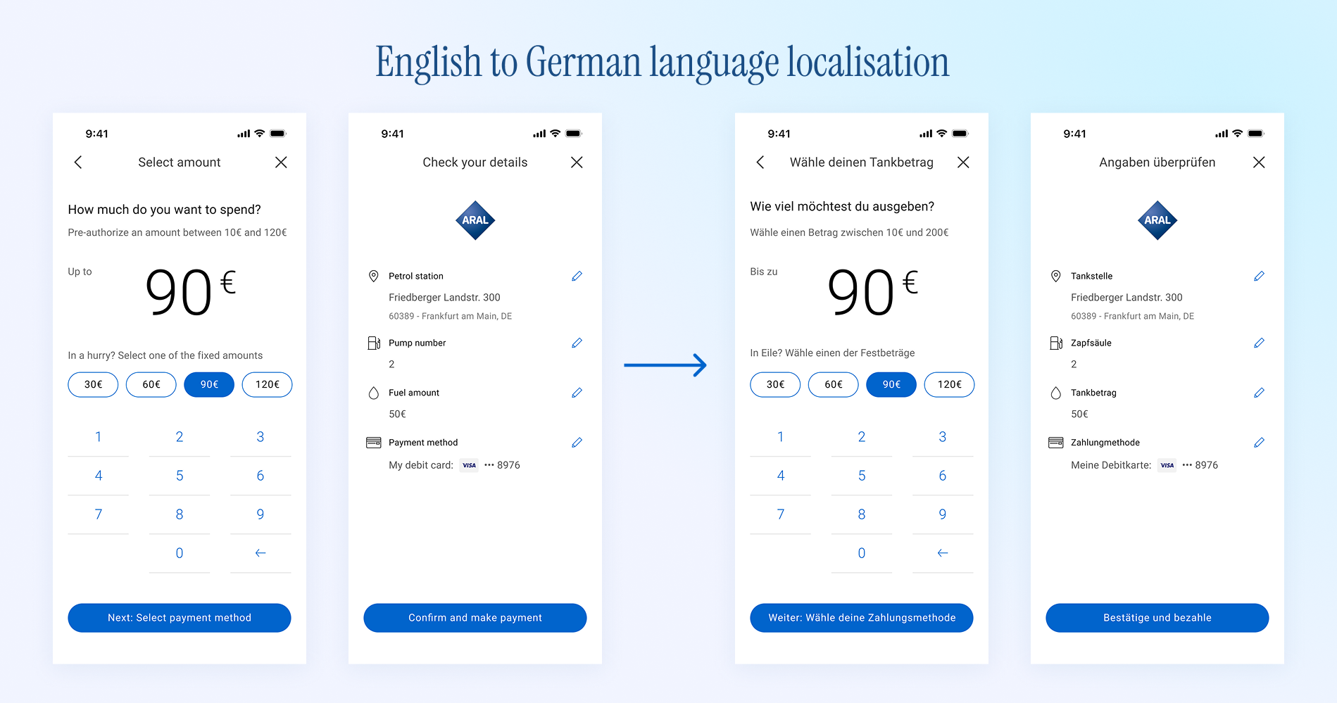
German text could run significantly longer than English, and Aral required a different brand expression from BP. I considered text expansion, regional labels, local rewards, and different brand treatments before the screens were fully polished.
This helped the same core flow work across BP and Aral markets, while still giving each region enough room to meet its own language, brand, payment, and loyalty requirements.
I also checked the same core screens across BP and Aral visual treatments. This helped us see whether the interaction still worked when brand colours, labels, loyalty content, and regional payment options changed.
By the end of this phase, Pay for Fuel had moved from a focused card-only transaction into a flexible, market-ready production journey. It established a stronger foundation for payment, loyalty, receipts, transaction status, recovery states, localisation, and market adaptation.
Phase 4
Designing Click & Collect
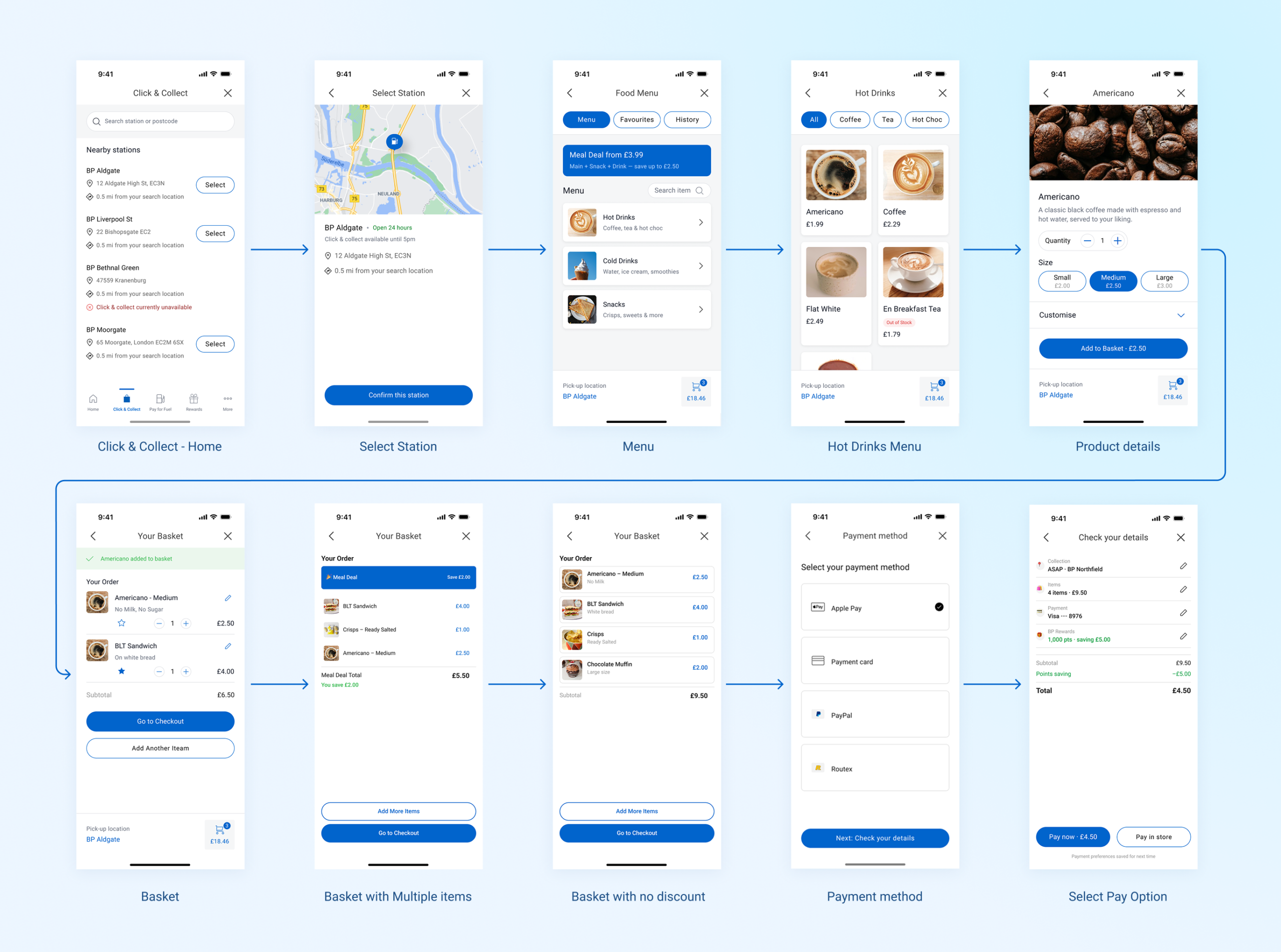
For Click & Collect, the journey started with store selection. This was important because food and coffee availability depended on the selected store. Showing the store first reduced the risk of customers browsing items that were unavailable at their chosen location.
From there, the flow moved into browsing, item detail, basket, payment, order confirmation, and collection. This made Click & Collect feel closer to an order-ahead store experience than the shorter transaction flow used for Pay for Fuel.
The journey also needed to handle different product types. A packaged snack could go straight into the basket, while made-to-order items, such as coffee, needed a customisation step for choices like size, milk, or other options. I designed customisation as a conditional step, so simple items stayed quick to add, and more complex items gave customers the choices they needed before checkout.
I reused familiar BPme patterns where they helped, including station selection, service availability, payment, loyalty, transaction status, and recovery states. The journey also needed new patterns for menu availability, item customisation, collection instructions, and order progress.
A key design challenge was helping customers trust the timing of the order. They needed to understand where to collect, when the order would be ready, and what to do if an item became unavailable or the store could not fulfil the order.
The final flow gave customers a way to choose a store, browse available items, place an order, and collect it at the station with clearer status and fewer in-store steps.
The Impact
Multi-market rollout, with commercial metrics omitted
Global implementation: Pay for Fuel launched first in Germany and the UK, then expanded to Australia, Poland, and Spain. Click & Collect launched in the UK and Australia.
Two connected station-service journeys: The work supported paying for fuel from the car and ordering food or coffee ahead of arrival.
Delivery efficiency: For BP, the shared model helped reduce duplicated delivery effort across markets. Instead of each regional team designing and implementing its own version, teams could reuse the same core journey patterns and adapt the parts that needed to change locally.
Public product signals: In the UK, the BPme app held a strong 4.8/5 rating across more than 160,000 ratings. Pay for Fuel was central to the app’s public value proposition, with the App Store positioning BPme around “Pay for Fuel in Your Car.”
In New Zealand, the BPme App Store proposition highlighted “Pay for Fuel, Coffee & Carwash.” Public reporting from that market showed that BP’s fuel payment and coffee pre-order experience helped save customers more than 25,000 hours and contributed to a 6 to 10% uplift in visit frequency.
For confidentiality reasons, I have omitted internal commercial performance metrics and transaction volumes.